How to Build a Data Analytics Dashboard for Your SaaS Company
Modern businesses rely on data to tap insights about market demands, expectations, and interactions. The more data you have about your potential buyer, the merrier, right?
Well, not necessarily.
Research suggests that most businesses cannot benefit from more than 27% of the data at hand. This means that roughly 73% of that critical data is dumped simply because business leaders and decision-makers cannot access or make sense of it.

This is where data analytics dashboards come in. These intuitive visual dashboards are designed to integrate customer data from different sources and present a consolidated view to the users, enabling companies to benefit from the entire set of data on a fuller scale.
In this article, you will take a deep dive into
- Why businesses use data analytics dashboards
- The benefits these dashboards provide
- Practices that can help you build an interactive dashboard.
Let’s get started.
Why Do You Need to Use a Data Analytics Dashboard?
A study published by MIT researched the effects of companies using dashboards to consume their analytical data and confirmed that these dashboards allowed companies to progress faster and generate more profit.
On the flip side, organizations that failed to use dashboards spent more time trying to analyze their data and spent more money on resources to do the job for them. This leads to a lot of lost information in the matrix; it also means that organizations are likelier to lose against a competitor who’s using dashboards.
One of the main things businesses do wrong is not focusing on their data. While it’s important to have new strategies in place for your organization’s growth, it’s also important to first evaluate former data that can help you scale your business.
You have to extract relevant data from different product touchpoints to better analyze the decision-making journey of your potential customer. A data analytics dashboard helps you do just this by gathering and consolidating everything from data of various customer touchpoints, the campaigns that gained the most traction, peak traffic times, and the most viewed products, and even key metrics such as customer lifetime value, monthly recurring revenue, and cost of customer acquisition.

This data allows you to maximize profit margins by evaluating campaigns and structuring resources to enhance sales and development.
Of course, while it all sounds simple, one major concern is how you assemble all your data from marketing, sales, finance, production, customer support, etc., on one platform.
This is where you will benefit from the data analytics dashboard.
A data analytics dashboard uses the information fed to and analyzes it based on different metrics. It gives you a rundown of how your business is currently performing through accurate insights into customer payouts, marketing spends, time to acquisition, etc.
Let’s say, for example; you’re developing a time tracking website and want to acquire insights into how long a customer stays on a particular page, your website’s bounce rate, your page loading time, your top-selling and least performing plans, and more.
Now, if you try to analyze all of this data manually, note the changes, and strategize how you can improve your business, not only will it take more time, but there are more chances that minor details will also be overlooked. Additionally, you will have to take time to evaluate the collected data and might still end up with incorrect insights.

On the other hand, your competitors who use a data analytics dashboard will carry out the same amount of work in significantly less time and have a detailed overview of all of their relevant data updated in near real time.
They’ll be able to see the rundown of the business, the best-selling pricing plans, their most viewed versus the least performing plan, and insights into why a certain plan was not as popular among the users.
Furthermore, they can also enhance customer service and improve their product touchpoints. Taking the same example of the time tracking tool, your data analytics software may use detailed graphs to show that a certain tier with strict employee surveillance features is not as popular among users; you can leverage this information to send a comprehensive survey to your existing clientele and improve that particular module within your application.

What are Some Benefits of Data Analytics Dashboards?
Now that you know why your company should use an online business dashboard, let’s dive a little deeper, shall we?
- Real-time Analysis and Visualization of Data
Did you know that data-driven organizations are 23 times more likely to gain customers as compared to organizations opting for traditional strategies?
When you use data analytics, you’ll have access to all of your data in real time. Any delay in the visualization can increase the risk of losing important data.
In some cases, even a few hours of delays can make the information useless. One of the key benefits of dashboards is that they allow data to be visualized in near real-time. In this way, organizations can make important decisions immediately.
What’s best is that dashboards are not complicated to use, either.
Dashboards are often highly interactive, allowing users to easily start leveraging their data for decision-making instead of wasting time trying to figure out what the next step should be.
- Complete Business Overview
An online business dashboard is the perfect solution if you’ve had trouble with increasing your revenue and customer retention. Not only will you benefit from gaining a complete overview of your customer interactions and customer profitability, but you will also understand customer behavior and be able to track specific KPIs. Here are a few things you can view on your dashboard:
- Time a customer spends on your website
- Pages they view in one session
- Number of visitors
- Total sales
- Revenue
- Profit
Through this, you can track your company’s progress and evaluate your steps moving forward.
- Personalization
Instead of spending too much time sifting through unnecessary information, you can customize your SaaS dashboards to ensure users can view the most relevant information in the beginning according to your preferences. You can also customize certain parts of the tool like the type and color-scheme of visualizations or the metrics you wish to track on priority, etc.
- Improve the Position of the Business
Organizations receive an overwhelming amount of data per day. They need to analyze and interpret all of this data to leverage it, which can be quite a challenge. Interactive dashboards allow users to benefit from visualizing growth, making it easier to comprehend.
They simplify complex data into easily understandable visuals, which allows non-tech professionals to easily understand and make critical business decisions based on it.
How does this help you?
Once you find out which strategies worked best for your business, you’ll be able to use these findings to create better, more personalized strategies in the future as well.
Best Practices for Building a More Interactive Dashboard
When creating a SaaS dashboard to visualize your data, it’s imperative to create one that is concise, clear, and user-friendly. All data should be available at one glance, easily decipherable, and must be prioritized according to business goals.
A few simple best practices can help you build more interactive dashboards that enable you to structure your processes efficiently. Here are the vital practices you should focus on:
Focus on Your Audience
The first step in designing an interactive dashboard is considering the audience. Every organization is different, and their purpose for an interactive dashboard varies.
Hence, when building a data analytics dashboard, it’s necessary to consider the purpose and the devices users will access it on. This will determine the design you choose and information you want displayed on the dashboard.
In either case, design is key to understanding information and making the necessary calculations. The trick is to use a simple design, enhanced charts, and clear graphs.

The image above is a great example of an interactive dashboard. You can see how the audience, whether they are high-level executives or company representatives, can easily understand the information provided.
Set Business-Specific KPIs
Setting your Key Performance Indicators allows you to set their goals and determine the target audience.
Let’s say you’re trying to simplify the sales cycle for your SaaS business. In such a case, you should ideally keep track of very sales-specific metrics such as the amount of time it takes to close a deal, how many meetings it takes for a deal to be closed on average, and the sources of these customers. The best part about interactive dashboards is that they can be adjusted exactly as you want them to be so that you can keep track of the most relevant metrics almost in real time and make any changes based on the data.
Compare Old and New Data
It is critical to compare the previous data with the new one while analyzing information to make more sense out of it. The values on an interactive dashboard enable users to compare values in real-time and understand what actions are required and where. Data collected and reported on these dashboards provide a visual aid to maximize information.
When you set comparisons between, for example, targets or projected values, you can further enhance your strategies to cater to the points where you lack.
Pro tip: Add titles to charts and simplify the design to create a better understanding for the user.
Data Analytics Dashboard Example
Now that you understand the key principles of creating a relevant online business dashboard let’s look at a few examples to help you better understand how to create one.
We’ll begin with a simple example; you own a SaaS company providing users with a tool that helps enhance their writing skills. You developed the software, designed the marketing campaigns, and launched the business. It’s been a year, but now you’re finding it difficult to calculate the revenue generated and compare it with previous data.
What do you do?
Of course, if you’re in the dark about dashboard designs, you’ll have to dive into each data, spend a significant amount of time comparing each result, and then creating the strategy.
There’s an easy way out!
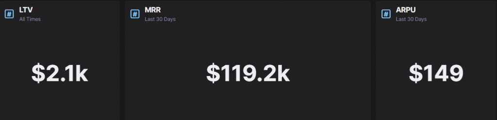
A revenue intelligence dashboard template can help you set the values you need to view in one board. Let’s say the monthly revenue you generated through subscriptions was approximately $119.2k. While the MRR would help you determine the revenue earned over a period of thirty days – according to the time you set – you will still need the ARPU and LTV values to understand the position of your business.
With all these values in one place, it’ll be much easier for you to understand what your revenue looks like – and where you should be making improvements.
To enhance your board, you can proceed by adding graphs for each set of information. Your graphs can look something like this:
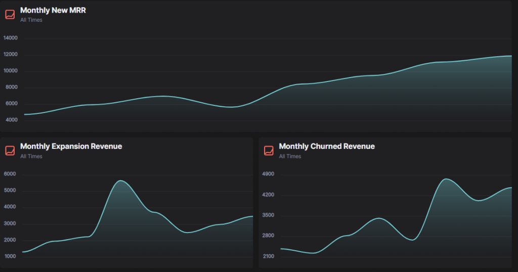
With the right data analytics tool for SaaS, these values will be updated in real-time to show you how data changes and when the most revenue is coming in.
But that’s not all that you need to know.
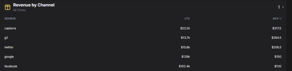
Remember how you kept running marketing campaigns for your business? These campaigns might have contributed to these revenue numbers you just saw. But if you don’t have the data from the campaigns, how will you understand your customer touchpoints and how much revenue was brought by each channel? Ideally, your interactive dashboard should also help you add the customer touchpoints and have a way to unify data from marketing and revenue.
Here’s what that can look like:
You’re almost there!
Now that you know the values and graphs you wanted to incorporate and have divided the data according to your company’s requirements, you can choose the right template and create the right data analytics dashboard for SaaS.
Create Better Analytics Dashboards with HockeyStack
HockeyStack is an analytics and attribution tool that helps SaaS companies to successfully measure metrics from different departments, including sales, marketing, revenue, and product, and unify them without typing any code.
You can quantify your business growth easily with the help of templates and integrations, easy to understand and use for consumers.
For more dashboard options, you can check our live demo and find an array of templates that best suit your business needs.
FAQs:
What is a dashboard, and why is it important for data analysis?
Data dashboards allow businesses to analyze, track, and display data and evaluate the organization’s position in the market. They provide insight into how departments and processes are helping the company grow.
What are the three types of dashboards?
There are three types of dashboards. They are:
- Strategic dashboards
- Operational dashboards
- Analytical dashboards