6 Best Dashboard Software & Tools
A dashboard is a visual display of your data for monitoring the health of a business or department by displaying all management KPIs (key performance indicators) and vital data points in one place. A dashboard utilizes data visualization to simplify complicated data sets, allowing users to receive an overview of current performance at a glance. All data can be visualized by software using charts, graphs, or maps.
To simplify large data sets and aid in discovering data processing trends, you can benefit from various software. It helps customers keep track of their company’s performance at a glance.
Dashboard software may be used in various company operations, including marketing, human resources, sales, and manufacturing. In this article, I will be listing the 6 top dashboard software and share information about their features, pros, and cons to help you make an informed decision.
HockeyStack
HockeyStack is an end-to-end attribution and analytics tool for SaaS companies. It unifies marketing, revenue, sales, and product data into one dashboard so that you can understand what really drives revenue at your SaaS. It’s completely no code, and it doesn’t require any setup.
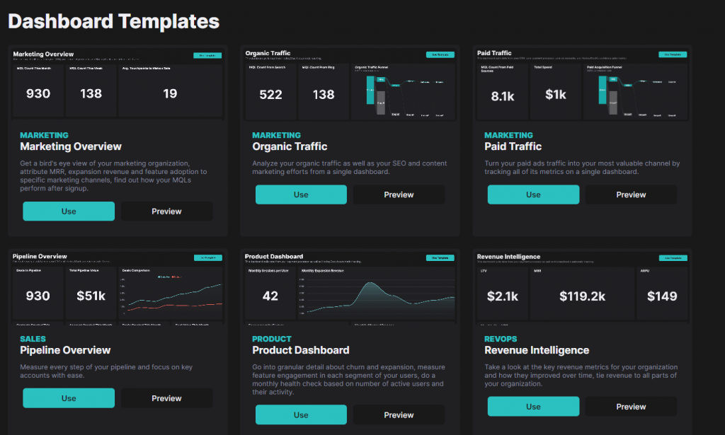
The best part about HockeyStack is that it’s completely no-code which means that you’ll be able to visualize your data without worrying about the technicalities of doing so. HockeyStack does not only give you the option to create dashboards from scratch but also comes complete with a number of templates that you can choose from to speed up the entire process.
With HockeyStack’s dashboards, you can answer inter-departmental questions that you cannot answer with any other tool on the market, such as:
- How much revenue did a certain blog series bring us?
- What is the activation rate of users from Facebook Ads?
- What does the customer journey look like?
- Do users that affiliates bring churn faster than users that marketing brings?
- Does a net negative churn seem possible in the near future?
and more.
In doing so, HockeyStack allows SaaS businesses to get rid of fragmented data and start understanding what really affects their revenue. The best part about the dashboards created by HockeyStack is that they are completely customizable, allowing users to change everything from the date range to the type of visualization such as bar chart, line graphs, etc.
Let’s see how different types of visualizations look in action.
Here’s a report on blog posts that drive revenue:

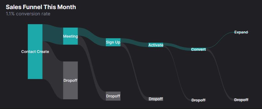
Here’s a sales funnel depicting each step that the user took to reach a goal:
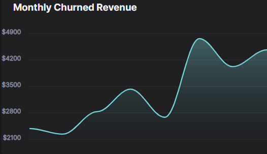
And here’s an area graph showing how the churned revenue changed over time:
HockeyStack’s Features
HockeyStack offers these features with no code:
- Step-by-step user journey
- Custom dashboards
- Funnels and goals
- Insights
- Surveys
- Revenue analytics
- Segments
and more
HockeyStack Pricing
HockeyStack has two plans, both of which have a 14-day trial with a 30-day refund guarantee.
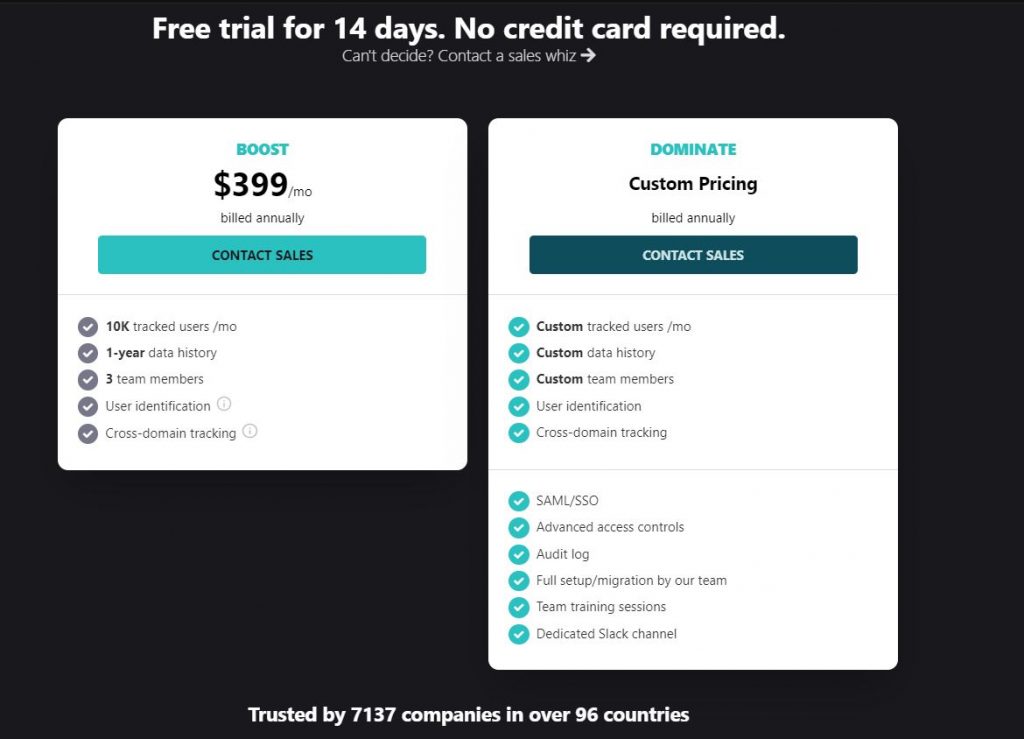
You can check out the pricing page here.
HockeyStack Integrations
- Paddle
- Stripe
- Hubspot
- Pipedrive
- Mailchimp
- Intercom
- Chameleon
- LinkedIn ads
- Crisp
- Salesforce
- Zapier (coming soon)
HockeyStack Summary
The unique benefit of HockeyStack is its ability to unify your marketing, revenue, sales, and product data using no code and visualize this data without connecting to a third party tool. This allows you to uncover unique insights that you wouldn’t be able to by using multiple tools as they cause you to have fragmented data.
HockeyStack Reviews
Here are some reviews of HockeyStack:
“A new visual approach to check what matters. I love the setup speed of this product. In a matter of minute you begin seeing traffic and you can setup the first goal, like a button click, or the visit of a page. Integration in wordpress for all my sites and blog are as easy as copy and paste. I love how goal are managed, and how easy is to create funnel that leave by that goals.“
“Covers many of the things natively missed by Google Analytics. We use Hockeystack in our agency to pull in additional information for our clients and to also be able to present some of the data in an understandable & visual way.“
“In the “new era” of iOS14 update my favourite is Cookie-less tracking – simple 1-line website integration – automated insights are giving you valuable information without the need for you to dig deep into data – cross domain tracking – visual funnels are also useful.”
Visualize Free
Visualizing is the ideal methodology for sifting through multi-dimensional data to discover patterns and aberrations or slicing and dicing data with easy point-and-click approaches. InetSoft’s Visualize Free is a cloud-based data visualization tool for small enterprises. It’s based on InetSoft’s commercial dashboard, reporting, and data mashup platform.
So, Visualize Free may be the ideal match for you if you’re seeking a means to graphically examine and display data that typical office charting software can’t handle. Businesses use Visualize Free to have a better understanding of and control over pertinent data.
Here’s what you should know about Visualize Free:
- Dashboards may be shared across a LAN or WAN
- Designer by dragging and dropping
- Bubble charts, trellis charts, and multi-charts are examples of multi-dimensional charting
- Data exploration brushing (highlighting related data across multiple charts)
- Geographical mapping of the highest level
- Calendars, range sliders, gauges, and crosstabs are examples of dual-purpose input/output selection components
Multi-dimensional reporting
Annotations to dashboards and visualizations are simple. Mobile dashboards are available via a browser on Android-based tablets, smartphones, iPads, and iPhones. All leading online browsers, including Chrome, Internet Explorer, Firefox, and Safari, are supported with or without a Flash plugin, allowing infinite multi-dimensional charting.
Pricing
You can use Visualize Free for free but you will have access to limited features and data sources. For additional information, please get in touch with Inetsoft.
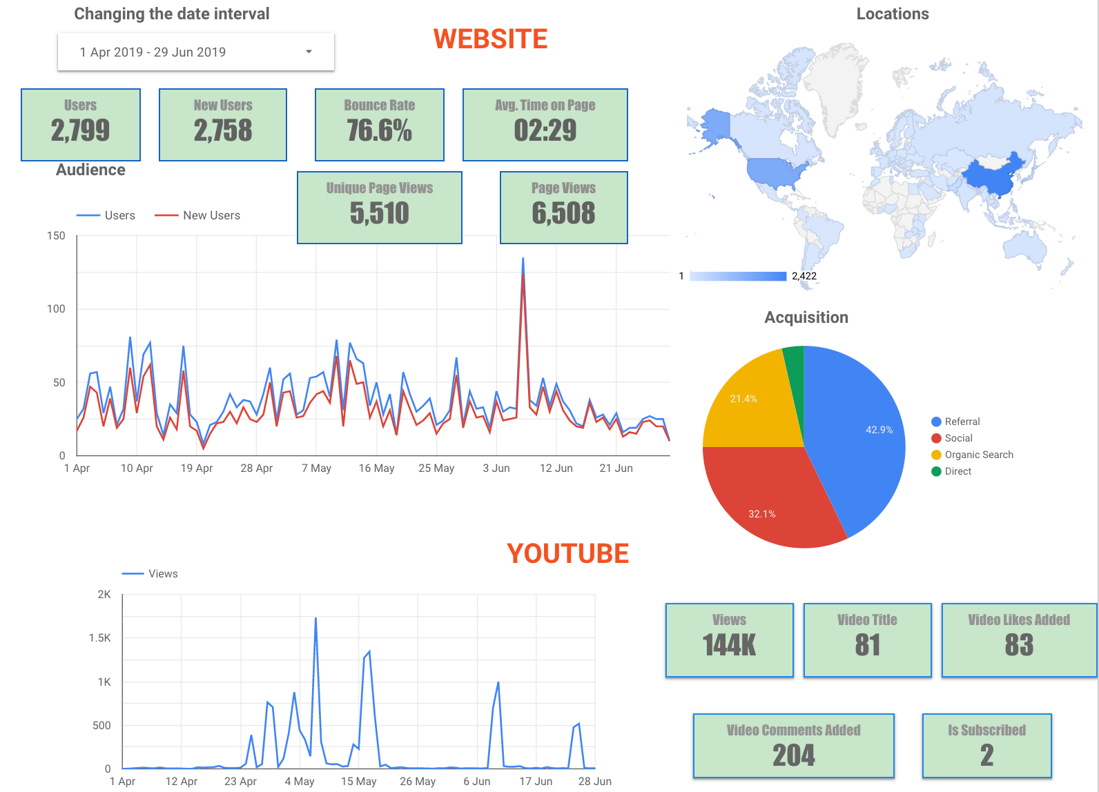
Google Data Studio
Data Studio is a reporting tool that allows you to construct highly bespoke dashboards and visualizations from various data sources. Google launched Data Studio in 2016. Since then, it’s gained a lot of interest, particularly among marketers and data analysts. Data Studio is an entirely free application and does not have a premium version.
Also, Data Studio is a cloud-based application. You may access it as long as you have a browser and an internet connection. You may use Data Studio to connect, analyze, and present data from various sources. The reports you make are immediately stored on Google Drive, making them accessible at any time and from any location.
Here’s what you should know about Google Data Studio
- Reports that are dynamic and can be updated automatically.
- Connections to other Google services such as Analytics, Adwords, Search Console, and Google Sheets are simple to set up
- You have the ability to share reports with other team members and clients
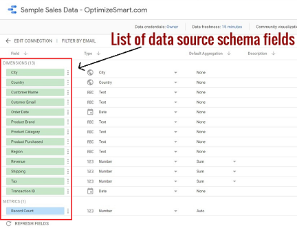
- Unfortunately, it is not possible to integrate data directly from Excel sheets in Google Data Studio
Scheduling a Report
It’s crucial to regularly share the data visualization reports to ensure that everyone’s on the same page. To do so, you can leverage Data Studio’s Schedule email delivery tool. You may prepare a report for your customer and set a delivery date for it.
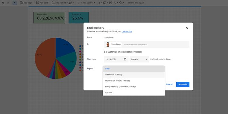
When the report is due, Data Studio will immediately notify your team member or client. You may also change the Repeat settings to tell the tool whether the customer needs reports at specific intervals.
Interactive Data Visualization
A reader may change practically anything from filters to metrics to gain different insights from your reports. Data Studio Explorer allows the reader to go deeper into your report by breaking down your graphs and tables into little chunks of information.
When viewing the databases of a report, viewers do not need to be SQL database specialists. Visual searches are available for users to use to explore databases.
Multiple Data Collection Sources
Data Studio has over 490 data connections and can analyze raw data from over 800 data sources. As a result, data from third-party sources such as Funnel, TapClicks, Amazon Seller Central, Asana, Jira Cloud, and others may now be imported.
You may also give the program permission to access and analyze data from Google technologies such as Campaign Manager 360, Google Analytics, MySQL, and Google Sheets.
It also uses advanced encryption technology to protect your data in transit and within the tool. Encryption technology at present, uses 256-bit encryption that secures the data in transit between the server and the browser. It is a minimum accepted encryption strength available that keeps data theft away.
Pricing
Google Data Studio is free forever.
Reviews
‘‘I like how Google Data Studio makes visual representations of your data so you can understand it and make correct decisions. It also allows for simple and easy comparison of different data sets, so it’s exciting to play around with. ” Ben M. stated, Owner of a Small Business
‘‘ It is a simple tool where you can keep all the import custom reports in one spot with availability to easily share with a team and collaborate on those reports as a whole. It normally is great at downloading and keeping things organized and efficient. I love the many types of reports in the tool and that you really can have anything created to fulfill reporting needs for clients and as a company.” Ashley H. stated, Social Media Specialist from a Mid-Market Company
Uncover Actionable Insights
Create customized dashboards to track the best performing content
Try HockeyStack Today
Cyfe
Cyfe is a dashboard program that allows you to track and visualize your company’s performance. This user-friendly software is appropriate for all types of organizations. You may use pre-built templates to get started with your dashboards.
You may discover online dashboards and link your data to them and rapidly develop social media to examine your data dashboards, such as those for Facebook Ads. You may also look at your website’s performance and discover where your visitors are coming from. It is effortless to gain insights into your target audience with this dashboard software.
Here’s what you should know about Cyfe:
- Using custom widgets or the Push API, securely show data from your company’s databases
- Share dashboards with anyone, including management, customers, and vendors
- Data from the past is archived within Cyfe, ensuring that you never lose track of it
- In PNG, JPEG, PDF, and CSV forms, you may download or schedule email reports on your data
- Rotate one or more dashboards on your big screen display automatically
- Branded reports, domain name mapping, dashboard backdrops, and other features are available
White Label Reporting and Upsell
If you run an agency, you may use vacant dashboard space for advertising other services and upsell and profit from white label reporting.

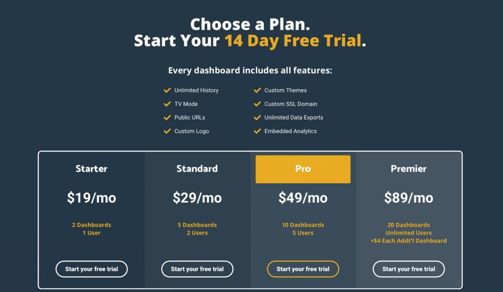
Pricing
Users can try Cyfe for free for a 14-day trial period. If you wish to keep using it after the trial period finishes, you must choose from the alternatives below.
Reviews
”With this analysis tool, we have obtained an almost immediate and constant update with our clients through our social media platforms, which has kept us in contact simultaneously without any inconvenience. Its price is relatively low concerning most programs that are available. In our license, they offer us a refund if the monthly work does not meet expectations. Although we can not see them directly, they have many integrations, looking well in depth we can find everything we need.” Peter P. stated, Senior Principal Software Engineer from a Mid-Market Company
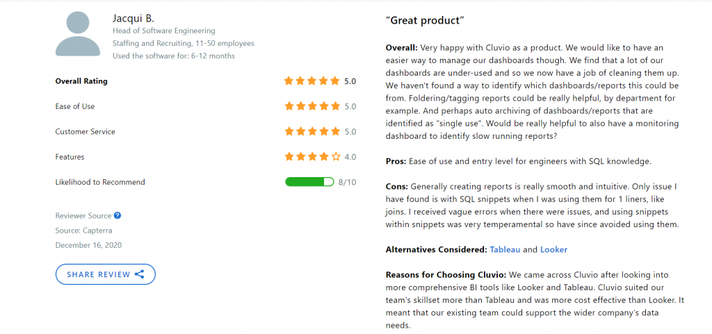
Cluvio
Cluvio is a cloud analytics tool that also serves as a dashboard. This software employs the SQL and R programming languages to examine your data. It provides you messages when there is a decrease in orders or an increase in mistake rates. It aids in the creation of interactive dashboards for your business.
You may use actual data to uncover the truth and inform everyone about your company’s success. It also creates well-designed charts based on SQL-based statistics and allows you to share your dashboards with others. Cluvio dashboards are simple to use and provide time-based filtering. It focuses on giving you the necessary SQL query ideas.
Here’s what else you should know about Cluvio:
- Many cloud business intelligence tools start at a few thousand dollars per month. Cluvio’s pricing is better suited to smaller and younger businesses.
- Redshift, Postgres, MySQL, MariaDB, AWS Aurora, Google Cloud Spanner, Google Big Query, Google CloudSQL, Microsoft SQL Server, Oracle, and Exasol are all supported by Cluvio.
- Syntax highlighting, clever context-sensitive autocomplete, SQL snippets, and more are just a few of the features available.
- The “Almanac” not only visualizes your data model, but it also automatically proposes SQL queries that you can use to examine your data more simply.
Interactive Dashboards
Cluvio’s dashboards are interactive, so you can alter the aggregate, choose a specific timeframe, or filter dashboards by any single attribute of your data.

SQL Alert
It’s simple to describe circumstances you’d like to be notified about using SQL alerts. The alerts run according to your schedule, and you’ll receive an email if the alert condition is met.

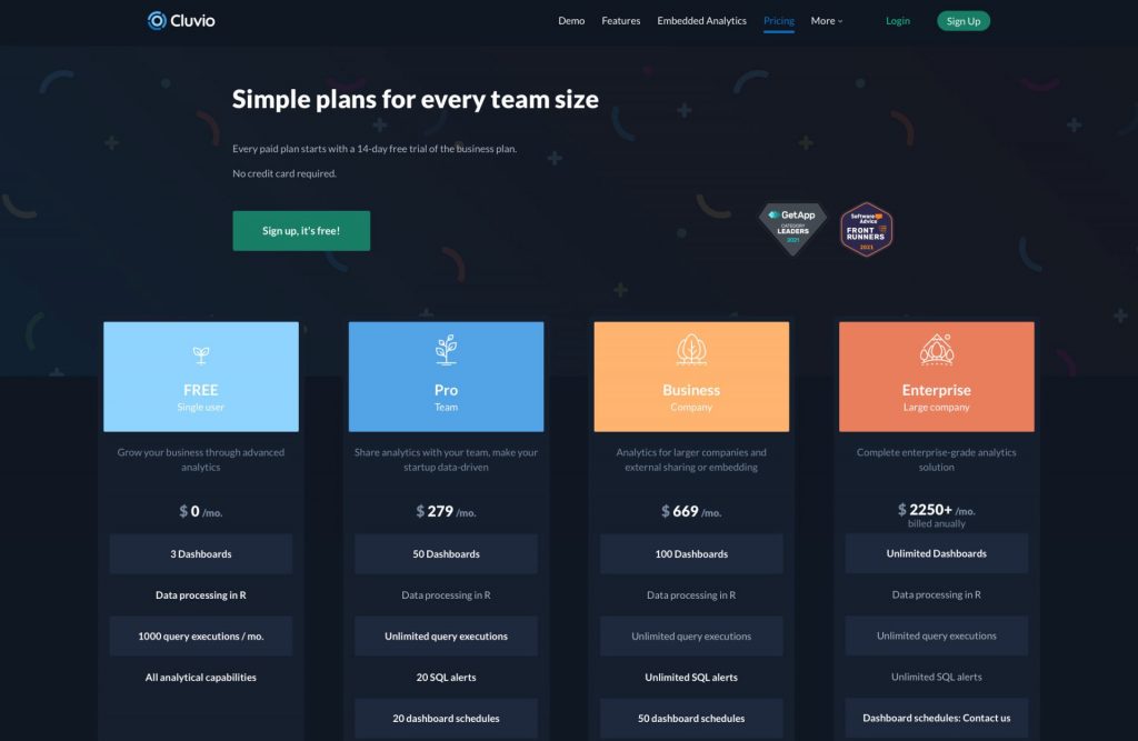
Pricing
You can always go for the free option with restricted features. However, if you want to use all of the features of Cluvio, you’ll have to choose from the premium choices listed below.
Reviews
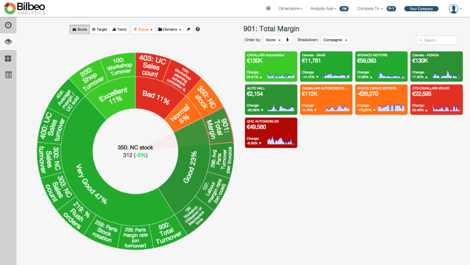
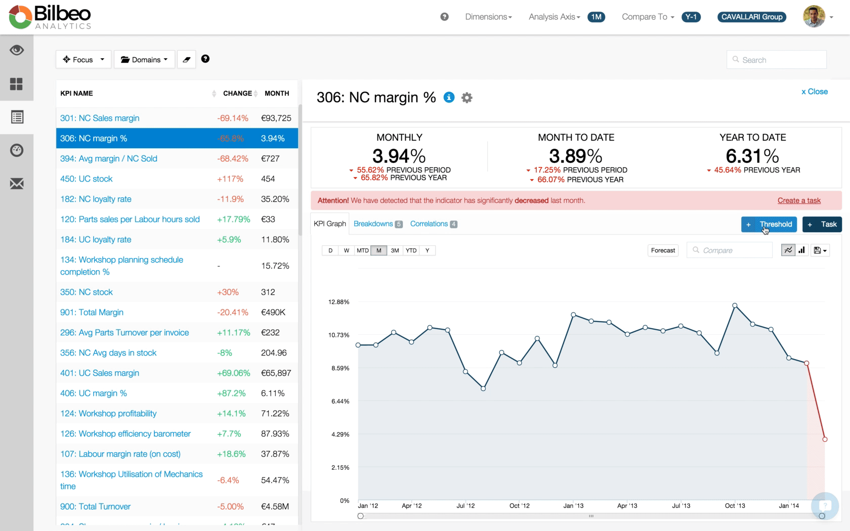
Bilbeo
Bilbeo is a user-friendly dashboard program that allows you to monitor and control the operations of your company. To improve your company’s performance, use a data mining algorithm map to identify leading indications.
With the aid of this program, you can quickly detect bottlenecks and figure out how to navigate through them. Its goal is to use this dashboard to track your performance and understand the overall picture of your organization. This program does not require any coding or configuration and allows you to auto-populate your dashboard.
KPI Dashboards
Bilbeo Analytics allows users to create KPI dashboards on the fly. The software’s exclusive algorithms and technologies generate dashboards based only on company data—no coding or design required. This feature enables simple performance management by allowing users to regulate and understand company performance quickly.
Automatic visualizations are included in the KPI dashboards, providing an actionable view of where the business stands. Automated KPI dashboards are available from Bilbeo Analytics for various sectors, including Sales and Marketing, Human Resources, Finances and Accounting, and Corporate Management.
Different Resources
SQL databases, NoSQL databases, data warehouses, API data sources, and Excel files are all supported by Bilbeo Analytics.
The SQL desktop agent feature allows users to connect to their local database with a single click. Bilbeo Analytics can connect to IBM DB2, MariaDB, Firebird, PostgreSQL, and Microsoft SQL Server, among other databases.
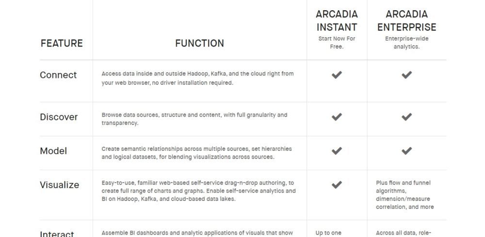
Arcadia Data Instant
Arcadia Data Instant is a data visualization dashboard. This application is built on top of a cutting-edge data platform. You can keep your data safe while getting a complete picture of it. This program doesn’t require any driver installation, and you may use your web browser to retrieve data stored in the cloud.
This program also has advanced analytics capabilities. It aids in the transparent discovery of data sources and establishing a hierarchy in the data collected.
You can build graphs using the drag-and-drop tool, and you can also put together intelligent dashboards to zoom data to any number with accuracy. It allows you to share and publish your dashboards and streamline the monitoring and deployment process.
AI Powered and Faster Insights
By integrating visualizations into web-based apps and white labels, you may also develop visual analytics applications directly on the data lake using powerful BI analytics interfaces.
You can also construct visualizations, dashboards, and apps with no IT involvement and create visualizations, dashboards, and applications with easy drag-and-drop operations.
However, interactive visualizations may respond to natural language data queries. Machine learning scores the questions against all data sets and past preferences to display the best responses. Share AI-backed data insights with clients and internal teams to improve company strategy.
Pricing
You may start using Arcadia Instant for free. However, in order to use Arcadia to its full potential, you must upgrade to Arcadia Enterprise. You may get more information about Arcadia’s pricing by contacting them.
Reviews
“The interface is pretty good and easy to understand. I have used Tableau before and I can say that compared to Tableau I felt it very easy to get around Arcadia in terms of data connection and making visuals.
We are still resolving business problems with downloads, filters not sticking to what is being selected. Benefits are that users can create their own copies and work around the visuals that they want.”
Conclusion
Your dashboard needs are unique and might evolve. That said, to ensure that all types of users with varying levels of technical expertise are able to create and analyze custom dashboards with ease, it’s imperative for you to choose a dashboard tool that does not have a steep learning curve, offers multiple integrations, and is not difficult to set up.
Complex tools may also necessitate additional training, dramatically lowering your return on investment (ROI).
Use this list of the top dashboard software to help you make an informed decision when you’re on the lookout for your next dashboard software. After all, you need reliable information to locate your best software fit, so you can save time, remain on a budget, and spend more effort on building your business.
Yes, Data Studio by Google is free to use for anyone.
There are a variety of dashboard software to pick from; you must analyze your individual needs and expectations to choose which one is best for you.