Dashboards vs. Reports: What Should You Use and Why?
It is a fact that data is the main element needed in company decisions today. Data helps you understand the ecosystem, trends in the market and the customers you need to sell to. In addition, it enables companies to execute more successful strategies and increase their earnings.
There are many ways to view and review data. Two of these ways are by creating dashboards and reports.
But what’s the difference between these two? And when should each of these be used?
Let’s find out!
What are reports used for?

Reports are static documents that show basic numbers, graphs, and tables. You often send reports periodically to other members of the team or other stakeholders to get an idea of trends or to make deductions. They generally contain data that is previously cleaned, sorted and parsed for a specific time period.
Let’s take a closer look at this with an example.
Let’s say your stakeholders need to be aware of the marketing progress of your newest product. In such a situation, you might need to inform them with reports. But as I mentioned earlier, because these reports are not live, your stakeholders cannot have real-time information about the progress. You should provide them with reports periodically to keep their information up to date.
What are dashboards used for?
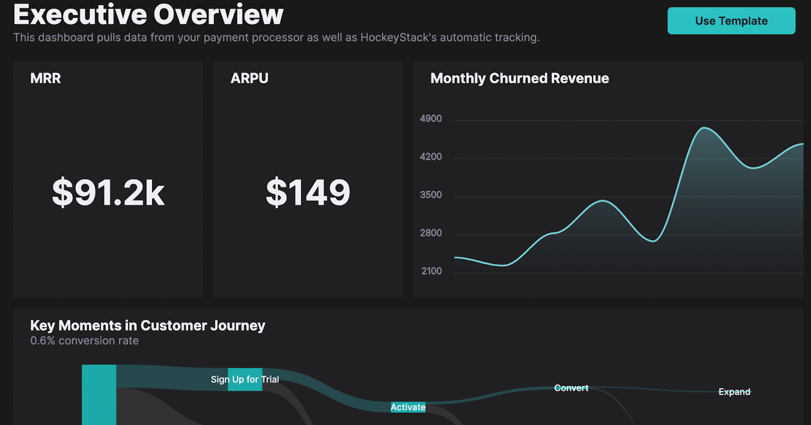
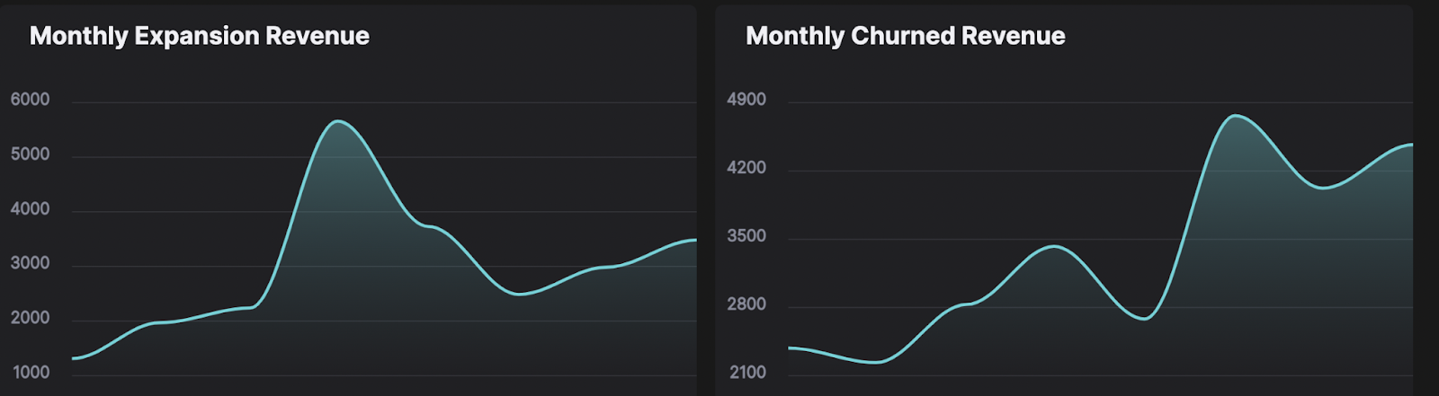
Dashboards are customizable data visualization elements that you create to display key metrics, KPIs, and data for your company. Dashboards, unlike reports, are dynamic. For this reason, the data is updated in real-time, and the dashboards are constantly changing accordingly. Also, you can refresh dashboards, modify existing metrics, and add new ones.
These dynamic and customizable features of dashboards allow you to use them in different areas and in different ways. For example, you can create a dashboard for a niche area such as content marketing, or you can create a sales dashboard that provides an overview of the sales and how sales figures have grown with time. Each team can essentially create their own custom dashboards and get more insight into their processes.
Dashboards vs. reports: what are the differences?

By now, you may have noticed a thing or two about the differences between dashboards and reports. Taking a closer look at these differences, however, can help you determine how you can best present your data under various circumstances.
So let’s take a closer look: What are the key differences between dashboards and reports?
Scope
Reports generally focus on a specific topic and provide in-depth information to you or the person you’re presenting the report to. On the other hand, dashboards are used to explain the overall situation and provide a broad pool of information by utilizing multiple data from different sources. That’s why dashboards have a wider scope than reports.
Let me explain this with an example. Say your goal is to showcase your company’s marketing success. For this, you can prepare a report showing the wins of your marketing team in the last quarter.
In this report, you can show the evolution of your marketing funnel, display the growth rates in your MQLs, and refer to other detailed numerical data about your campaign’s success. The report’s scope highlights these marketing metrics and explains what your marketing team’s efforts mean to the company.
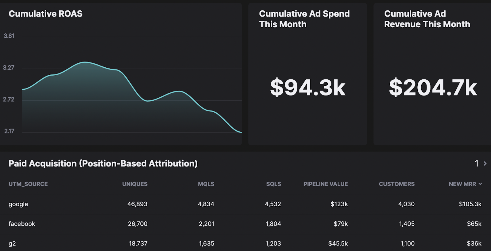
You can also make a dashboard for the same purpose. The dashboard can contain various information, including financial returns and returns on ad spend from all paid channels. Dashboards allow you to navigate visualizations of this and other metrics and KPIs. This way, you can instantly have comprehensive information about the company’s marketing campaigns.
Interpretation
Reports and dashboards differ not only in scope but also in the way information can be interpreted. Reports allow for much more personalized interpretations compared to dashboards. When people prepare a report, they add their own perspective to it. They reach the data and include the insights they create accordingly in their reports.
Most reports contain paragraphs of text describing the data and graphics included. In addition, reports may include recommendations based on your analysis. These especially make sense in reports you create for presenting to a client because they help your clients see things through the same lens as you.
On the other hand, dashboards are almost like information libraries updated in real time. They do not contain your interpretations or insights. They consist of objective information and statuses based entirely on data.
Purpose
Another crucial factor distinguishing reports from dashboards is the purpose for which they are created. You should ideally create reports if you:
- Need to keep your team updated on a project
- Must disclose company
- Have to present an idea or notify a client
- Must summarize the results after finishing a project
As you can see, reports offer the most value when they are used to explain or present a situation. On the other hand, dashboards are best used to keep track of a situation. For example, if you are designing a new feature for your product, you can go over basic metrics and KPIs with the product dashboard. This way, you can determine the changes you need to make to your workflow to reach your goal.
How are dashboards used in business intelligence?
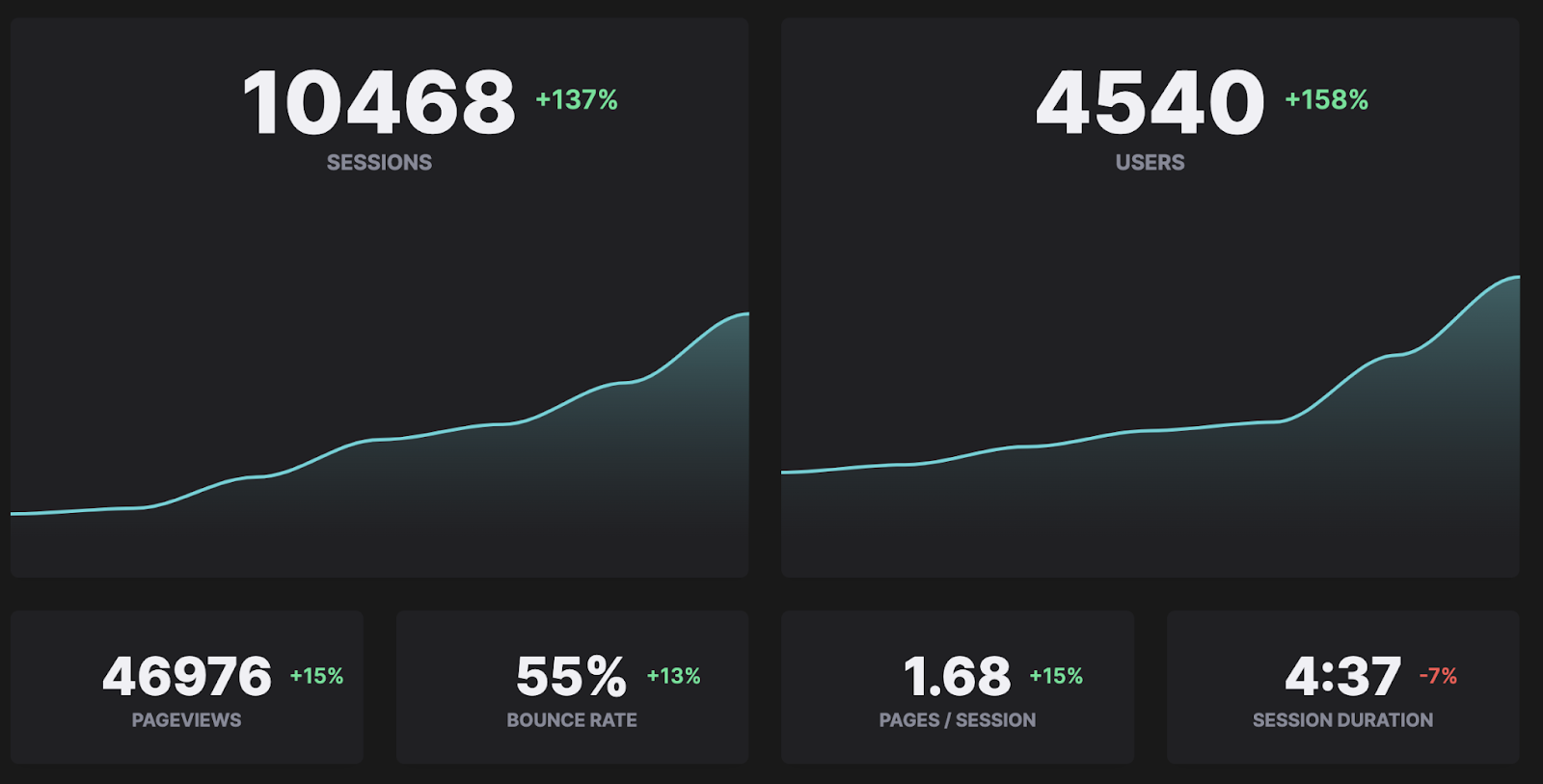
Dashboards are one of the most essential parts of business intelligence applications. They allow you to track the key pieces of information you need to manage your business processes on a single screen. BI dashboards create a unified view of all elements that will enable you to make the most accurate strategic or operational decisions.
BI dashboards are much more effective for decision-making than static reports because they are significantly more interactive. It also gives you more data for further analysis than charts and graphs can convey.
Here are some benefits of BI dashboards:
- Accurate forecasting: Analyzing current data and comparing it with the past helps you make accurate predictions for the future. You can identify patterns and trends between dashboards and data and create business strategies accordingly.
- Improve communication: You can easily share BI dashboards with teammates and stakeholders. This makes collaboration easier.
- Generate real-time insights: You need to stay up to date with KPIs and metrics to ensure things are running smoothly and respond to issues at the right time when needed. BI dashboards provide you with real-time data, allowing you to achieve this.
and much more.
So, how can you use BI dashboards in the most efficient and effective way? Here are some practices that will answer this question:
Determine why you are creating a dashboard
You can create different BI dashboards for many different departments and purposes. Therefore, before creating the dashboard, determine if a dashboard is even necessary for the situation. If you do decide that a dashboard will give you better insights than a static report, have a basic idea of the design that you’ll use to create the dashboard and know who will be using it.
Identify the required data sources
Once you have the users and purpose for which you will create the dashboard, it is time to define the data required for this dashboard. Collecting unnecessary data is not only a waste of time and resources. It also causes you to extract the wrong insights and develop ineffective strategies. That’s why you should be careful to identify data that will add value to your dashboard.
Choose the right data visualizations
Your audience can make more sense of the data with visualizations. If you’re confused on how you can visualize your data in the best way possible, don’t worry! You will find more detailed information about visualizations in the following parts of the article.
Best practices to improve data visualization with dashboards
I mentioned how meaningful the right visualizations are when creating dashboards. But what should you pay attention to to make dashboards more understandable and exciting with visualizations?
Here are some of the best practices of data visualization for more effective dashboards:
Choose the right visual
Once you’ve identified your audience and the metrics you need, it’s time to choose the visualizations that best represent them.
Here are some visualization types you can choose from:
- Line chart: Works well on small datasets where you want to show changes over different periods.
- Bar chart: You can use a bar chart when you want to compare data.
- Pie chart: Ideal for when you want to highlight ratios or percentages within your data.
- Column chart: You can use it when you want to compare various categories with subcategories.
Use predictable patterns

Visualizing the data in an orderly and meaningful way on dashboards is crucial for understanding the information. This will cause nothing but confusion unless you organize the data in numerical, alphabetical or other order. Also, make sure there is a link between the visualizations. In this way, you prevent the viewers of the dashboards from getting lost between two pieces of information.
Use different kinds of visualizations
Imagine a newspaper page. The news written in the biggest and most unique font on this page is the news that first catches your attention. This tactic can also be used when creating your dashboards. You can attract attention to the most important data by using larger charts and graphs.
Settling the dashboards vs. reports debate: Create what you need with HockeyStack!
Let’s be realistic. It is impossible to choose between Team Report or the Team Dashboard. Both have different functions and different uses. For this reason, you will often need both throughout your business life. Having an analytics tool that allows you to create both in accordance with your expectations will significantly reduce your workload and contribute to your company’s success.
With its no-code and easy-to-understand user interface, HockeyStack allows you to quickly create countless reports and dashboards that fit your needs.
Let’s take a closer look at how it does that.
Dashboards
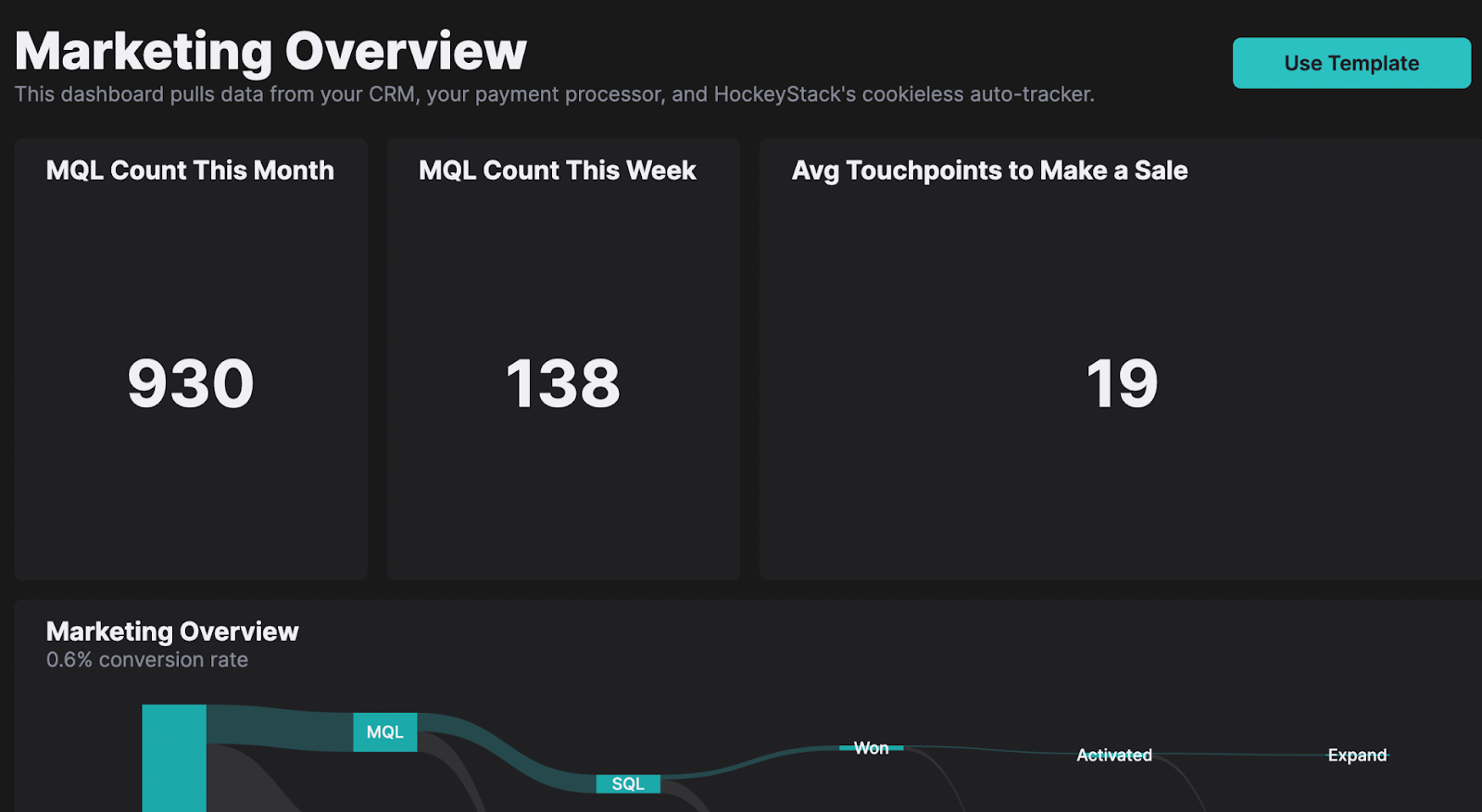
HockeyStack lets you create easy-to-use and understand boards for any topic you need insight into.
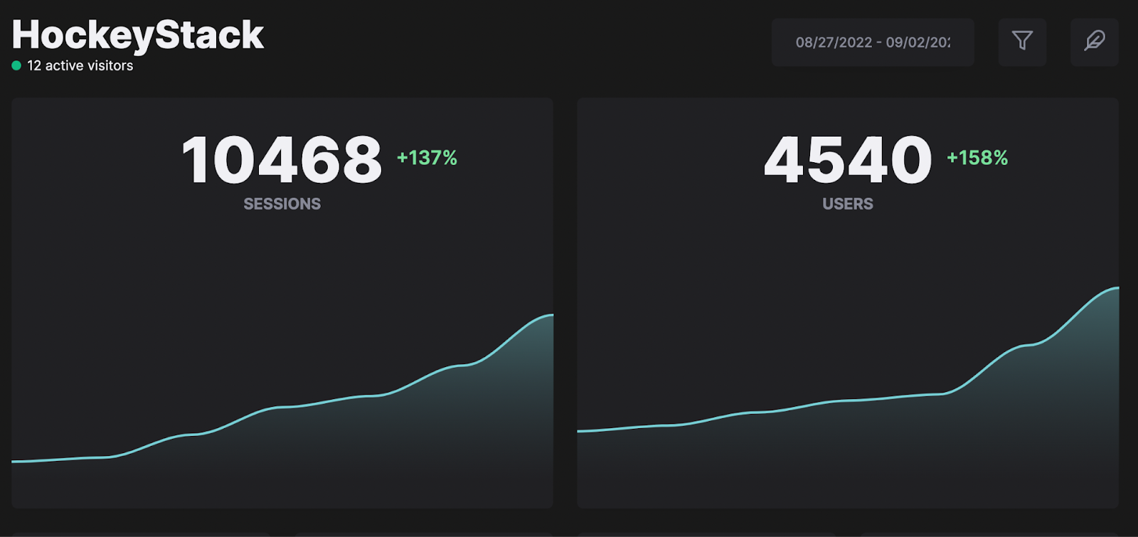
New to creating dashboards and don’t know where to start? Then you can use one of HockeyStack’s templates and customize it with the metrics you want according to your needs. Alternatively, you can create unique dashboards from scratch if you’re aware of what you need and are already aware of the best way to organize your data.
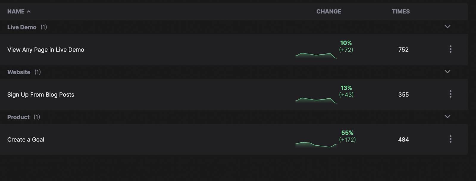
HockeyStack can also be used to identify the most common actions taken by your visitors automatically, so you can discover hotspots and define key goals with one click.
Reports

If you’re looking to create reports, you can easily do so with HockeyStack as well – that too without typing any code. Just like dashboards, you can start by choosing one of the numerous report templates, or you can create the entire report from scratch. All you have to do is choose a report type, choose what you want to measure, select the columns, and voila! Your report is ready.
What’s more, you can also add an association model, date/property filter, or group by attribute, such as date, URL, etc., to your reports if you’d like to make things easier for yourself.
Stoked to see what else is in store? Sign up for a demo now and try HockeyStack for free!
FAQs
A good report is easily understandable, based on accurate data, and has clear visualizations.
Dashboards allow you to present all your data easily to each stakeholder. They play an essential role in generating meaningful data-driven insights. This makes dashboards really useful and important.