7 BEST SaaS BI Tools for 2022
Business intelligence platforms are essential tools to help you make data-based decisions. These tools allow you to collect and visualize your data in one place. According to Deloitte, companies that make data-driven decisions are 59% more likely to act on their analytics results and 77% more likely to meet their business goals.
There is a wide variety of platforms currently on the market, from the most technical and complex BI tools to the most user-friendly and clean tools. Therefore, you need to decide on the features of the most suitable platform for your SaaS company by determining your data stack, the variations of the media from which you will pull data, and who should access your data. I’ve compiled six of the most preferred and diverse BI tools for you. Read on to know more about these tools.
#1 HockeyStack
HockeyStack is an analytics & attribution platform for SaaS companies. It unifies marketing, revenue, sales, and product data into one dashboard with no code so that you can understand what really drives revenue at your SaaS. It’s completely no code, and it doesn’t require any setup.
Since you have access to all important insights in one central location, it’s much easier to perform analysis and use your data for decision-making. The best part about HockeyStack is that you don’t even need to integrate with third-party visualization tools to get the insights you need. The tool comes with visualization templates, giving you access to graphs, charts, and funnels in just a few clicks. You can create dashboards using any metric you have, from your website, product, and all the other metrics you pull from your tools.
By collecting and connecting all your data in one place, HockeyStack allows you to answer questions, such as:
- How much revenue did a certain blog series bring us?
- What is the activation rate of users from Facebook Ads?
- What is the average contract value of sales that our whitepaper generated?
- Do users that affiliates bring churn faster than users that marketing brings?
and more.
With these answers, SaaS businesses can reduce overheads, streamline marketing activities, and minimize frictions in conversion.
HockeyStack’s Features
HockeyStack offers these features with no code:
- Step-by-step user journey to view interactions at each touchpoint
- Custom dashboards to visualize information instead of scouring through large volumes of data manually
- Funnels and goals to see how users progress through your pipelines
- Surveys to gather insights regarding user perception
- Revenue analytics to understand what truly drives revenue at your SaaS
- Segments to dive deeper into the types of users and to group them together based on behavior
and more
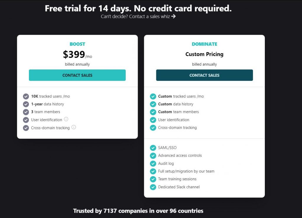
HockeyStack Pricing
HockeyStack has two different plans, both of which have a 14-day trial with a 30-day refund guarantee.
You can check out the pricing page here.
HockeyStack Integrations
HockeyStack can be integrated with a number of CRMs, email marketing tools, and payment processors to unify data easily. Here are some of the tools that HockeyStack can collect data from:
- Paddle
- Stripe
- Hubspot
- Pipedrive
- Chargebee
- Close
- Mailchimp
- Crisp Chat
- Salesforce
- Zapier (coming soon)
You can view the full list of integrations here.
HockeyStack Summary
The unique benefit of HockeyStack is its ability to unify your marketing, revenue, sales, and product data using no code. This allows you to uncover unique insights that you wouldn’t be able to by using multiple tools as they cause you to have fragmented data.
- You can integrate with your tech stack and build every single dashboard that you can think of, using all sales, marketing, revenue, and product metrics.
- You can create funnels, goals, and surveys, which are rare to get with other tools on this list.
- You don’t need any developers, tracking is cookieless, and the script is small, so it doesn’t increase your site loading time.
#2 Looker
Looker is a BI platform that stands out with its powerful data modeling and reporting features. It was founded in 1998 and was acquired by Google. Its proprietary modeling language LookerML is another feature that sets this platform apart from other BI tools. This language describes data relationships and calculations in a SQL database. Besides, Looker is entirely browser-based. Therefore, it does not need any desktop software.
Features
Here are some of the features of Looker:
- AB Testing
- Attribution Modeling
- Budgeting/Forecasting
- KPI Monitoring
- Time on Site Tracking
and more.
Looker Blocks
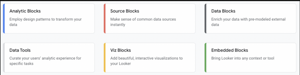
Looker Blocks are pre-built pieces of code that Looker prepares for the most common data blocks created. Thanks to these blocks, you can use the existing models instead of creating everything from scratch. In this way, you will make your work much more manageable.
Looker Blocks includes a wide variety of blocks for various needs. For example, these blocks can be multiple data blocks expressing weather or demographic data or numerous data analysis blocks for analysis such as cohort.
Data Transfer Between Different Platforms With Ease
Thanks to Looker, you can easily extract data from different platforms you use. Additionally, you can provide data flow by sending your data in Looker to Slack and Dropbox tools. This way, you can make the analysis process more transparent and understandable for your entire team. In addition, it is possible to turn your dashboards and reports into action with the integration of various SaaS applications.
Reviews
Looker has 4.6 on Capterra and 4.4 on G2. Here are some of the positive reviews:
“Looker has been a great and useful tool for our business. We’ve found challenges in the specific data dictionary and set-up, which internally was not well prepared before implementation.”
“Mediation layer management is excellent. It is “Code” based and not setup based, so it is straightforward to replicate/versioning and find “Hacks” to many needs, and GIT manages to version.”
On the other hand, here are some negative reviews:
“Unfortunately, their documentation could use some improving as often I find myself confused and unsure what to do with their docs.”
“To be fair, if you have a terrible underlying data warehouse, all Looker will do is expose that.”
Pricing
Looker sets its pricing based on your company’s needs and size. That’s why, unfortunately, Looker did not include any pricing information on its website. However, if you want to gauge the potential of Looker to meet the needs of your SaaS company, you can request a free trial version.
Tool Summary
Looker’s potential user base is quite inclusive, thanks to its ease of use. Plus, it’s entirely browser-based, so it’s not confusing for beginners. However, if your biggest expectation from the BI tool is elegant tables and visualizations, it would be more appropriate to turn to different alternatives such as Tableau.
#3 Tableau
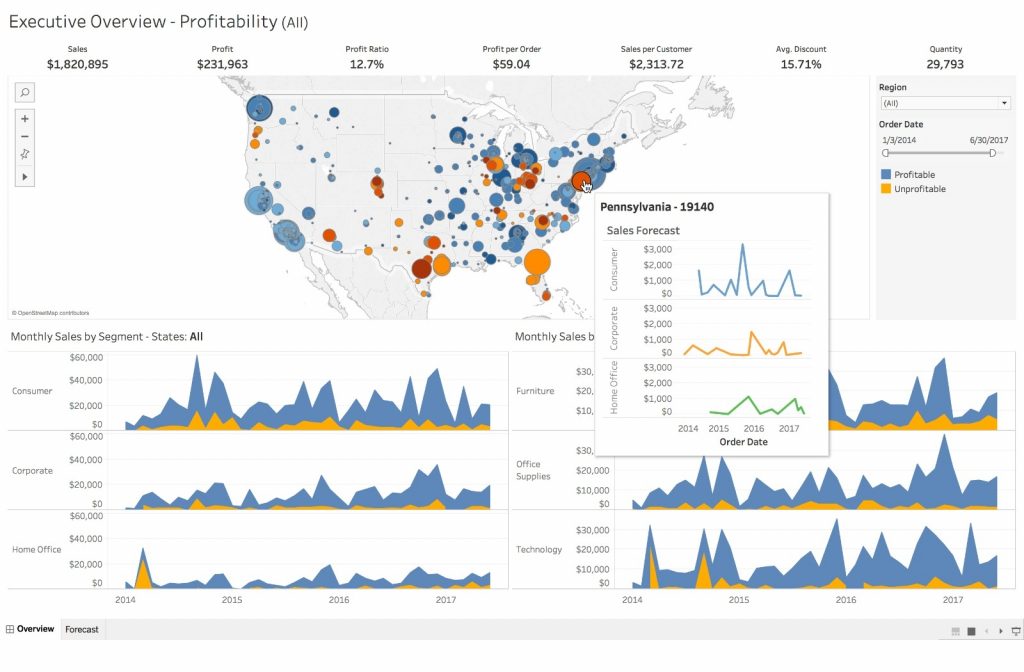
Tableau is a data visualization tool that turns data into visualizations to analyze and understand more clearly. These visualizations range from dacite bar charts to scatter plots and complex maps. Tableau was founded in 2003 and is affiliated with Salesforce.
Features
Here is the overall view of the features of Tableau:
- Customizable Dashboard and Reports
- Master Data Management
- Real-Time Analytics
- Scorecards
- Third-Party Integrations
and more.
Ask Data
Ask Data is a feature of Tableau that allows you to access your data by asking questions. This feature detects even conversational phrases such as “last week” and “most popular” and shows you the data you are looking for. In addition, these answers appear as visualized data sets automatically, without the need for you to understand the data structure and prepare a visualization accordingly.
Data Visualization Capabilities
Tableau gives you incredible data visualizations and immaculate tables. This way allows you to create descriptive dashboards that can easily understand your data even by someone who does not have any extra technical knowledge. You can also easily visualize large numbers of data sets with Tableau without any problems.
Reviews
Tableau has 4.5 out of 5 stars in Capterra and 4.4 out of 5 in G2. Some of the positive reviews about Tableau are as follows:
“What I like the most is the ability to dig deep into data to get a better insight. There are lots of features to take advantage of.”
“We use Tableau for the weekly review of metrics within the healthcare setting and love the ability to review our stats quickly. The software is clean and efficient.”
However, there are also some negative reviews:
“Large files take a while to load, and sometimes it will crash, which is inconvenient. Since there is no auto-save function, you can lose your work if it crashes.”
“Statement: the old invoice needs to be paid. So although we have written confirmation that the invoice is canceled, Tableau didn’t cancel, and now we have no money and no license.”
Pricing
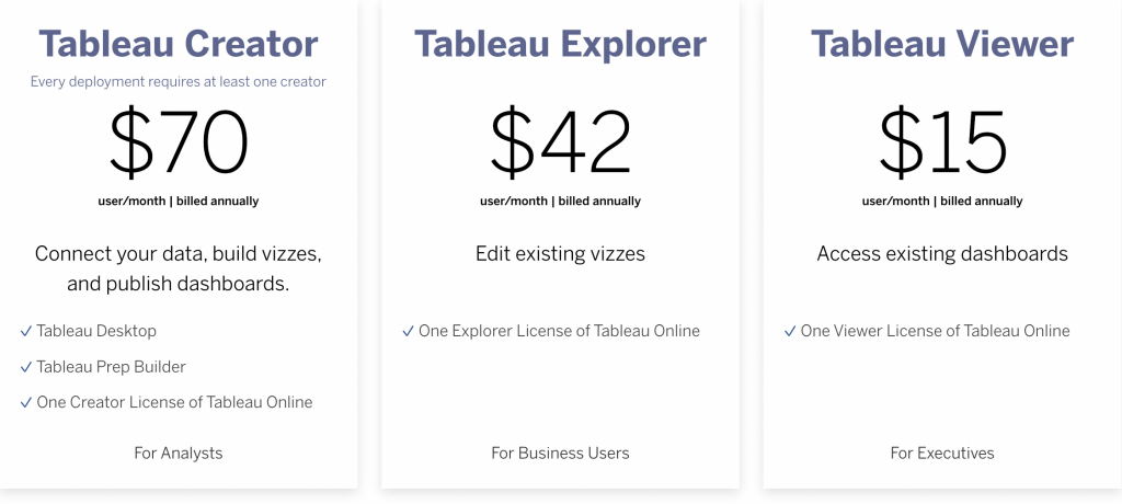
Tableau’s pricing is grouped under two headings: on-premises or public cloud installation and installation fully hosted by Tableau. Both pricing types are Tableau Creator, Tableau Explorer, and Tableau Viewer. Pricing for on-premises or public cloud is as follows:
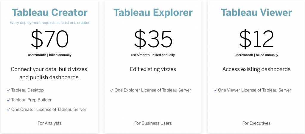
Pricing for using the platform deployed on Tableau’s servers is also as follows:
Tool Summary
To sum it up, Tableau gives you near limitless scope to visualize your data and is very easy to use. On the other hand, Tableau is more expensive than other BI and data visualization tools. In addition, it is a platform that focuses more on visuality than speed compared to other alternatives. Therefore, if your main expectation from the BI tool you will use is agility, Tableau may not be enough for you.
#4 Databox

Databox is a business analytics and reporting tool that allows you to monitor your data and performance in real-time. It was established in 2012. Thanks to Databox, you can easily collect your data from various sources in a single dashboard. Also, these boards are elementary to prepare, thanks to the simple drag and drop feature.
Click here to read about Databox alternatives.
Features
Here are some of the features of Databox:
- In-App Events Tracking
- Profitability Analysis
- Real-Time Analytics
- Scorecards
- Uninstall Tracking
and more.
Goals
With Databox, it is possible to visualize your current data and the goals you have set. You can set these targets within any metric and also from any dataset. In addition, you can manage and track your set goals from a single screen.
After you set your goals, Databox notifies you when you approach or move away from your goals. You don’t have to follow your goals’ visualization constantly. In addition, Databox creates short-term goals for you by calculating what you need to do daily and weekly to reach the long-term goals you set.
Looped Databoards
The Looped Databoards feature allows you to gather your multiple dashboards in one central report. In this way, you can easily share all your dashboards with others in a single report. In addition, thanks to Databox, you only need to create this report once. This report refreshes itself according to your data at certain time intervals.
Reviews
Here are some positive comments about Databox, which has a rating of 4.7/5 on Capterra and 4.4/5 on G2:
“One of the best for creating social and GA dashboards. This tool allows me to automate some of the monthly reports I was presenting, allowing me to save a great deal of time.”
“I used the software for two years, and I liked the idea of the software, creating dashboards for easy review. If they had only worked.”
On the other hand, negative comments are primarily about adjusting the date range:
“You can’t customize date ranges for reports. You have to choose from a weekly, monthly, quarterly, or yearly basis, but you can’t choose “Feb. 3, 2017 – Feb. 23, 2018,” for example. This makes reporting very challenging if, for example, you start an inbound engagement with a client during the middle of the year and want to report on 6-month efforts and 12-month efforts that don’t align perfectly with the Jan – Dec calendar year.”
Pricing
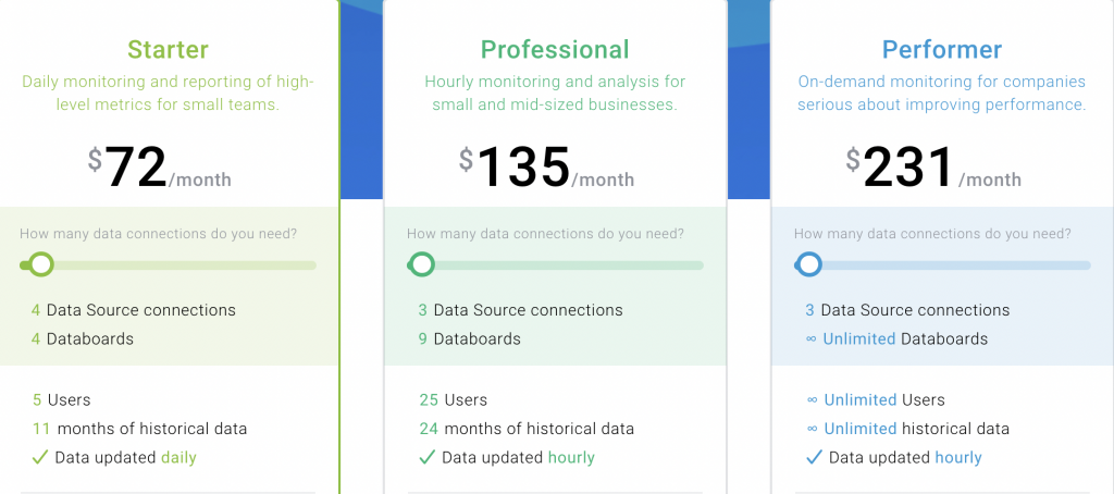
Databox, which has a free version with three connections and data boards, and a free trial period of 15 days, offers pricing that can be tailored to users’ needs, starting from $72 per month. This wide pricing range prevents users from paying for more services than they need.
Tool Summary
If you need a business intelligence tool where you can do advanced target planning and pull data from many different platforms, Databox is the platform for you. However, according to the users’ experience, it is possible to have problems with the real-time operation of some integrations. It would be helpful to keep that in mind as well.
#5 Power BI
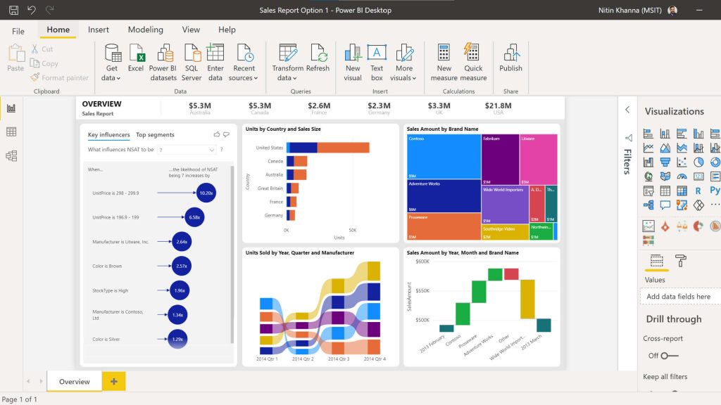
Power BI is a data visualization and business intelligence platform from Microsoft. It is an effective tool for creating interactive dashboards to combine disparate data or link datasets in a single report.
Click here to read about Power BI alternatives.
Features
These are some of the features of Power BI
- Customizable Dashboard
- Data Import/Export
- Reporting & Statistics
- Self Service Data Preparation
and more.
Ease of Loading Data from Different Platforms
Power BI has features that make it easy to put your data together. You can upload your data from Excel or CSV files and cloud-based platforms such as OneDrive and Salesforce. This tool currently supports over 70 connectors.
Power BI has a drag and drops feature. Therefore, it does not need any coding or copy-pasting before loading data. This feature also makes the data upload process even more accessible.
Familiar Features for Excel Users
Power BI offers a very similar interface to Excel. If you are an advanced Excel user, you will adapt to this platform much more quickly, thanks to some Excel-like features included in Power BI. In addition, Power BI integrates seamlessly with Excel, eliminating the need to export your files. Combining your data with Excel makes it easier for you to get used to it, primarily if you use other Microsoft products.
Reviews
Power BI has 4.5 stars in Capterra and 4.4 in G2. Some of the positive reviews about Power BI are as follows:
“PowerBi empowers the user to develop a robust, beautiful, interactive, and powerful dashboard with less effort.”
“I engage with Power BI as a person who pulls reports from the dashboards, and for someone like me who is just now getting started in a data analytics role, it has been great.”
However, some of the negative reviews are as follows:
“I dislike the fact that we can’t use multiple datasets as sources so far. Also, if you are not familiar with DAX, you have limited possibilities to run measures.”
“Comparing with other competitor products, its lack of features.”
Pricing

Power BI’s pricing is divided into Pro and Premium, with pricing starting at $9.90 per month. Additionally, there is a free trial period for you to try.
Tool Summary
As your SaaS company, if you grasp the Microsoft ecosystem, Power BI may be the BI solution. However, it would help if you also considered that it has fewer features than other BI tools.
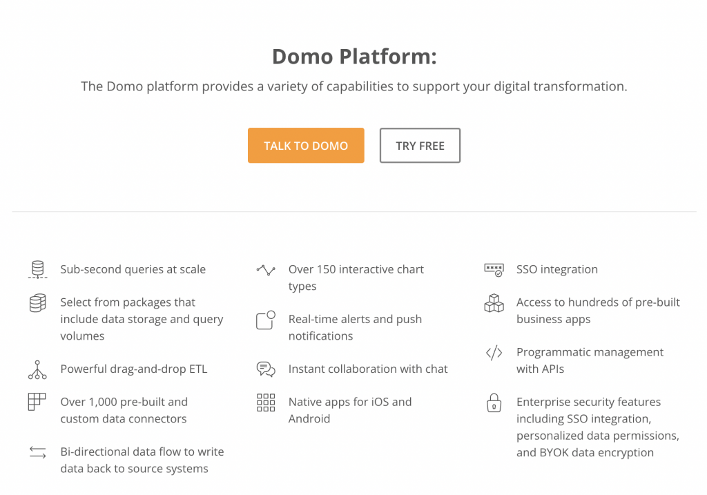
#6 Domo
Domo is a fully mobile and cloud-based business intelligence tool founded in 2010. Thanks to Domo, you can extract data from other sources and analyze them quickly.
Click here to read about Domo alternatives.
Features
Here are some of the features of Domo:
- “What If” Scenarios
- Budgeting/Forecasting
- Self-service Analytics
and more.
%100 Mobile
One of the most significant benefits of Domo is that you can access your data anytime and anywhere. It also provides this in existence on mobile. With Domo, you can access, visualize and analyze your data with just a few clicks, regardless of where you are. Domo’s mobile nature makes it faster and easier than other BI platforms.
Real-Time Integrations
With Domo, you get the chance to monitor and analyze data from different sources in real-time. Also, since Domo is a cloud-based platform, you can leverage and analyze data from any source, not just for the company.
Reviews
Domo has 4.2 on Capterra and 4.4 on G2. Here are some of the positive reviews:
“I like Domo. It’s hands down my favorite piece of software and my favorite company to work with.”
“Being able to see changes in things that go month over month (and even year after year) helps us make informed decisions that are in the best interest of our company and sales teams.”
On the other hand, some of the negative reviews are as follows:
“Basic functionality was confusing. For example, why did you need to go to another screen to sort columns.”
“The problem is that there’s a lot of variance for when the sources finish updating, so sometimes it updates without getting all the data in and looks weird.”
Pricing
Domo doesn’t have a specific pricing option because Domo creates a custom plan just for your company, based on your company’s needs. Therefore, pricing differs from company to company.
Tool Summary
Domo is the most suitable BI platform for you, especially if analyzing and visualizing your data in a mobile way from different devices is an essential criterion for you. However, in addition to this convenience, Domo also has some negativities. For example, it is less advanced in search and filtering than other platforms. Also, sometimes loading large datasets can be pretty slow. You should also consider all these.
#7 Google Data Studio
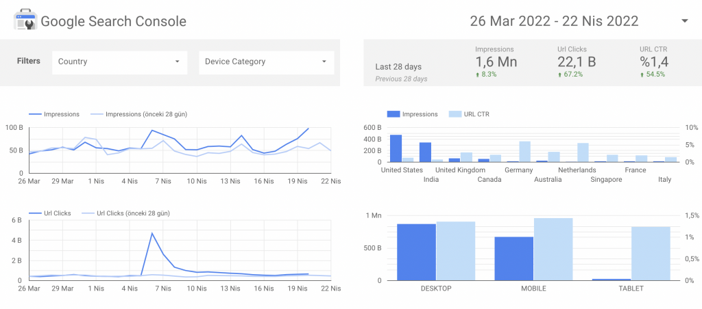
Google Data Studio is a BI platform that allows you to structure and visualize your data. It was released in 2018 and is a product of Google’s business intelligence. With Google Data Studio, you can extract, edit and visualize data from many data sources, primarily Google Analytics.
Check out Google Data Studio alternatives.
Numerous Data Sources
One of the most prominent features of Google Data Studio is that it offers the opportunity to extract data from more than 510 different sources. Thanks to this feature, you can combine and visualize data from many other data pools with the help of a single tool.
Beginner Friendly
For example, if you are a startup SaaS company and are just getting started with data visualization, the ease of use of Data Studio is a big plus for you. If you need help, Google Data Studio has an extensive library of resources. This feature makes Google Data Studio a suitable tool for startups.
Reviews
Google Data Studio has 4.5 on Capterra and 4.3 on G2. Here are some of the positive reviews:
“It’s a potent tool. Collaborating on reports with others is also rather easy, and it’s nice to make real-time updates with teammates.”
“It is amazing what you can do and all the options you have to do a drill down in the data shown. Dashboards can be shared with all the team at any time.”
Pricing
There is no paid version of Google Data Studio. You can access all the features of this platform completely free of charge.
Tool Summary
Features such as being completely free, having a lot of educational resources, and only needing to have a Google account to start using it make Google Data Studio very useful, especially for startups. However, when starting to use this platform, it is helpful to consider that although it can integrate tremendously with other Google products, you may have difficulties with 3rd party integrations.
Conclusion
Companies need business intelligence tools to analyze and visualize their data. Especially for SaaS companies, data is everything. In addition, choosing the right platform plays a significant role in the efficiency of this business. When deciding on the right tool, you should consider factors such as the needs of your business or the size of your company.