User Interface Design Principles to Implement When Launching a New Product
A good user interface (UI) is critical for achieving a good user experience. It should allow people to easily use your website or product. Whether you are looking to improve the design of your website/product or you are completely new to UI design, it is important to know a few rules and principles to have an effective and well-designed user interface.
In this article, I’ll be talking about user interface design principles, their importance, and how you can create an effective user interface for your product.
What is user interface design?
User interface design is about building interfaces in software or computerized devices with a focus on style and functionality. The designer’s goal is to create an interface that is both easy to use and aesthetically pleasing for the user.
What are the four elements of user interfaces?
User interface elements are the building blocks for interfaces. They are the parts that are used to build apps or websites. Moreover, these elements add interactivity to the user interface and make things easier for the end user.
Here are 4 elements of user interfaces that you should know about.
1. Input controls
Input controls are a series of UI elements that allow your users to input information so that your website/product can react according to their needs.
These elements can be checkboxes, radio buttons, dropdown lists, buttons, toggles, etc.
2. Navigational components
By definition “navigation” means to move around or find your way. In terms of UI design, Navigation is the set of actions helping users move around your UI so that they can use your product effectively.
These can be search fields where a user may search a keyword or a pagination system that divides your content between pages that users can skip to based on what they need.
3. Informational components
Informational components are elements that help share information with your users.
These can be tooltips that provide users with hints to explain an element, progress bars that show how much of a process is done and how much remains, or notifications that keep your users notified when something like an error or an update comes up.
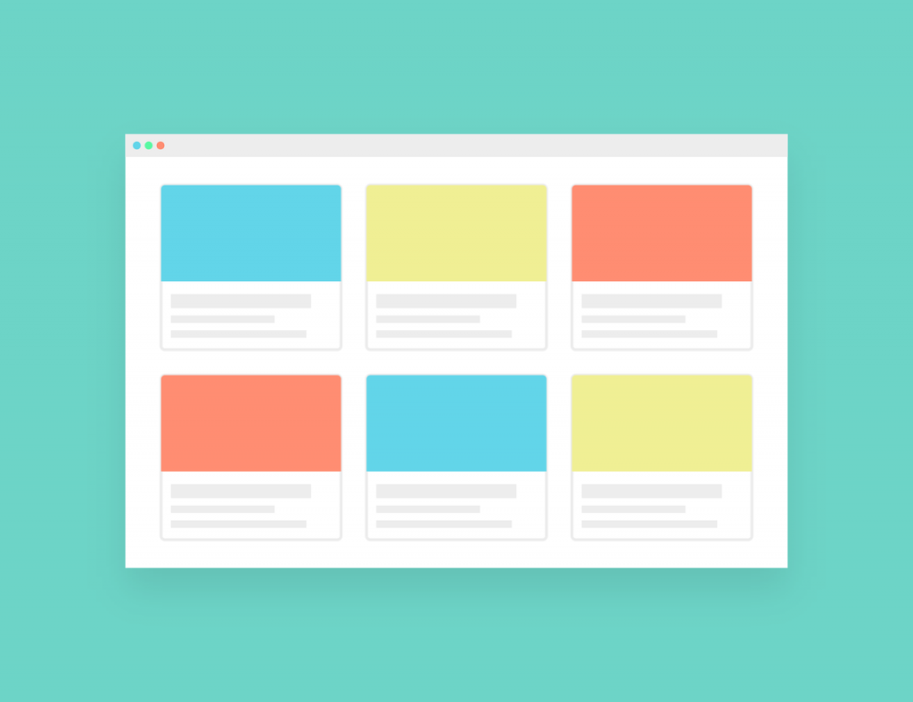
4. Containers
Containers are components that can hold together a full set of components and content that are related to each other.
These can be cards that are a module that contains different page information like buttons, texts, images, etc. Or scroll boxes that enable users to view a large quantity of information in limited space.
How important is it for product managers to be aware of UI design principles?
UI design is easily one of the most important elements of a website/product. If your users can’t use and navigate your product effectively, it doesn’t matter how many features it has or how revolutionary you think the idea is.
This is why a product manager should be aware of the key principles of UI design.
The UI is the medium through which your users interact with your product. You should make sure your UI is user-friendly by abiding by the design principles to maintain a good customer experience.
If you are not aware of the UI design principles, it will be very hard for you to build or overview the building of a competent UI just by going with your instincts. There is a reason why people use the tried and tested methods in every aspect of business.
Does user interface design affect the customer experience?
As I mentioned above, your UI and user experience are closely related. As your UI is the way your customers experience your product, one can’t exist without the other.
As you know, even if you have a good marketing campaign to promote your product, even the best campaign can not make up for a bad product. It is the same with UI.
You can have a perfect marketing campaign and a truly brilliant product idea. But if your UI is ineffective, your users will not use the heaps of features you built as they might just end up getting frustrated and stop using it altogether.
To keep that from happening, having a seamless UI is imperative to offer a good customer experience.
User interface design principles to keep in mind when launching a new product
A successful UI is one that people would want to interact with. It is not exclusively about being aesthetically pleasing, but also about being easy for your customers to use. This is of high importance because a well-designed user interface can raise your website’s conversion rate by up to 200% according to research. Now, imagine what a good user interface could do for your product!

Here are 9 principles to keep in mind when launching a new product.
1. Keep it simple
Perhaps one of the most important UI design principles is never forgetting a good UI design is practical; never decorative.
It is easy to get carried away and add decorations and visual elements left and right. But doing this only creates unnecessary noise, distracting the users from the elements that are truly relevant.
Keep your design as simple as possible. If any part of your UI design has no practical purpose, it shouldn’t be there.
2. Predict what your users need
How do you know what is relevant for the user? One of the first steps you should take when designing a UI is making sure you understand your users and their needs. Once you do this, you will be able to predict what your user will want to do next.
Then you can provide your users with the exact information, resources, and tools they need.
3. Make users feel in control
Users should always feel fully in control even though they might not be sometimes. This means making the UI feel so natural and intuitive, that the user doesn’t even notice the interface being there sometimes. And your users shouldn’t feel like your interface is forcing them into a certain action or making decisions for them. Even if, as I said, that may be precisely what’s going on.
4. Be methodical and consistent
One of the most basic UI design concepts to keep in mind is keeping it consistent. Multiple colors, fonts, and styles may confuse the user whilst consistency creates familiarity.
Consistent UI means using similar design patterns, identical terminology and menus, and similar commands and shortcuts throughout the interface.
5. Avoid unnecessary complexity
Aim for the minimum number of steps and screens possible. Use containers to condense your data and reduce the clutter throughout your UI.
Be sure to organize your information in a way that is logical and self-contained. In fact, one of the golden rules is to always group tasks and subtasks together, not only by theme but also in a manner that is fully practical.
Also, don’t hide elements on pages or in containers where no one would think to look for them. Organize screens and their content according to a clear and logical grouping system.
Remember also to reduce the number of steps a user has to take in order to complete a task.
There is a rule that is called the “Three click rule” that states that a user should be able to achieve any action or access any information they want by clicking no more than three times in your user interface.
6. Have clear signs
Your UI layout should be intuitive. It should have clear labeling of information. Navigating your website/product should never be intimidating or confusing, even for someone that uses it for the first time. Your interface should be pleasant and users should be able to know what to do without thinking too much.
Make sure your pages and screens are simple, intuitive, and clearly signposted. Users should never doubt if they are in the right section of your website/product to get what they need.
Remember to leverage the navigational components I mentioned earlier in the article to help your users go back to where they were in the interface before or reach the feature they need.
7. Allow your users to make and undo mistakes
Everyone makes mistakes – but that shouldn’t prevent your users from finding value in your product.
Making it easy to backtrack whenever necessary is critical to ensure that. Implement an easy-to-use undo/redo function. This will not only help your users avoid the frustration of losing data and wasting time, but it also makes your users more confident to explore your product/website and make changes without the fear of losing progress.
8. Give relevant feedback
Keep your users informed about their progress. Provide them with the knowledge that their work in progress is saved, or their feedback has been received. Let them know that things are working as they should.
I have already mentioned the importance of keeping it simple, but some things such as this are more important. Your status info should be apparent, accurate, and easily accessible.
In the event of an error occurring, inform users in a way that they can understand instead of meaningless error codes. Let them know what went wrong and what they should do about it such as refreshing the page, checking the internet connection, or reaching customer support.
9. Design your UI for accessibility.
Don’t assume all your users are able to do everything you can do without thinking. This goes for everything from technical knowledge and abilities to cultural differences.
Products are used by people in different geographical locations and cultures. While you can’t account for every possible variation, don’t assume that the way you do things is ‘de facto’ all around the world.

For example, you can try to implement text-to-speech for your product for visually disabled people that might use your product. Similarly, you can try and reduce the number of animations and limit the use of too many bright colors as these might cause problems for some people.
Or, as you know, it is easy to think that your users have as much technical knowledge as you. You can try keeping the language you use throughout the UI simple and understandable for your audience.
Keep these factors in mind when creating a UI and keep it accessible for as many people as you can.
UI analysis: How do you know if your user interface resonates with your audience?
You designed your UI and now wondering if it resonates with your target audience. Luckily there are some metrics that will help you analyze your UI.
Here are some metrics that may help.
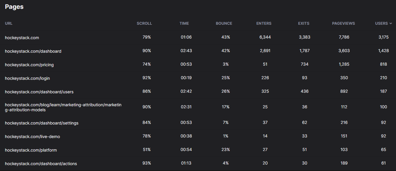
1. Time spent on product/service
This is a good way to calculate if your users can use your product for their tasks, even for hours without getting frustrated.
You can track users doing a certain activity down to the second. This can also be useful to know that you did a good job if you find out that your users spend little time on tasks that usually take longer.
You can also track average session lengths to measure the engagement level of your users. As I mentioned, the more time a user spends on your product, the more engaged they are.
2. Stickiness
Stickiness is the metric that measures the number of people that are highly engaged with your product. Highly engaged users are the ones that keep returning to your product/service. A high stickiness is often a strong indicator that people value your product/service.
But how do you calculate it?
To calculate stickiness, you need to first calculate these two metrics that are daily active users (DAU), and monthly active users (MAU).
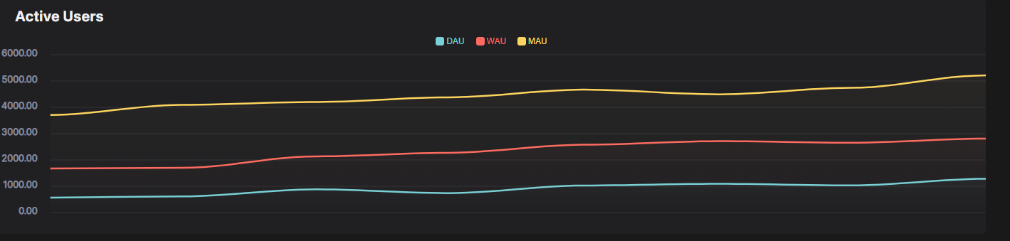
These two metrics can also be leveraged on an individual basis, as standalone metrics, to measure activation and retention.
After you calculated these metrics, The formula is:
Stickiness (%) = DAU/MAU
For example, if you have 1,000 monthly active users and 100 of them interact with your product/service every day, then the stickiness of your product/service is 10%
3. Feature usage
Feature usage metrics are a set of metrics that relate to the behavior of users towards a feature of your product. There are a lot of different measurements for feature usage. Some of them are:
- Percentage of feature users when taken over the total number of product users
- Total number of feature users
- The average time between feature usages of each user
By tracking these metrics you can evaluate if your UI enables your customers to find the features they need and use them effectively, also the effectiveness of said features themselves.
By seeing the usages of specific features you get the chance to make less used features more apparent or create a feature hierarchy by usage and then adjust your UI accordingly.
The formula to calculate average use per day is:

For example, you have 5,000 total uses per day, and 2,500 of them are unique users. Using this formula, the feature’s average use per day is about 2 times a day.
You can also find the percentage of unique feature users out of the total number of unique product users using the formula:

4. Surveys
Even though surveys are not necessarily metrics, they are just as important. With the use of surveys, you can find out what your users love and dislike about your UI, and work to improve it.
You can use all kinds of surveys like a typical NPS survey or any custom survey you think is necessary. You can get very specific with your surveys, asking about your UI and certain elements of it, what can be improved about it, etc.
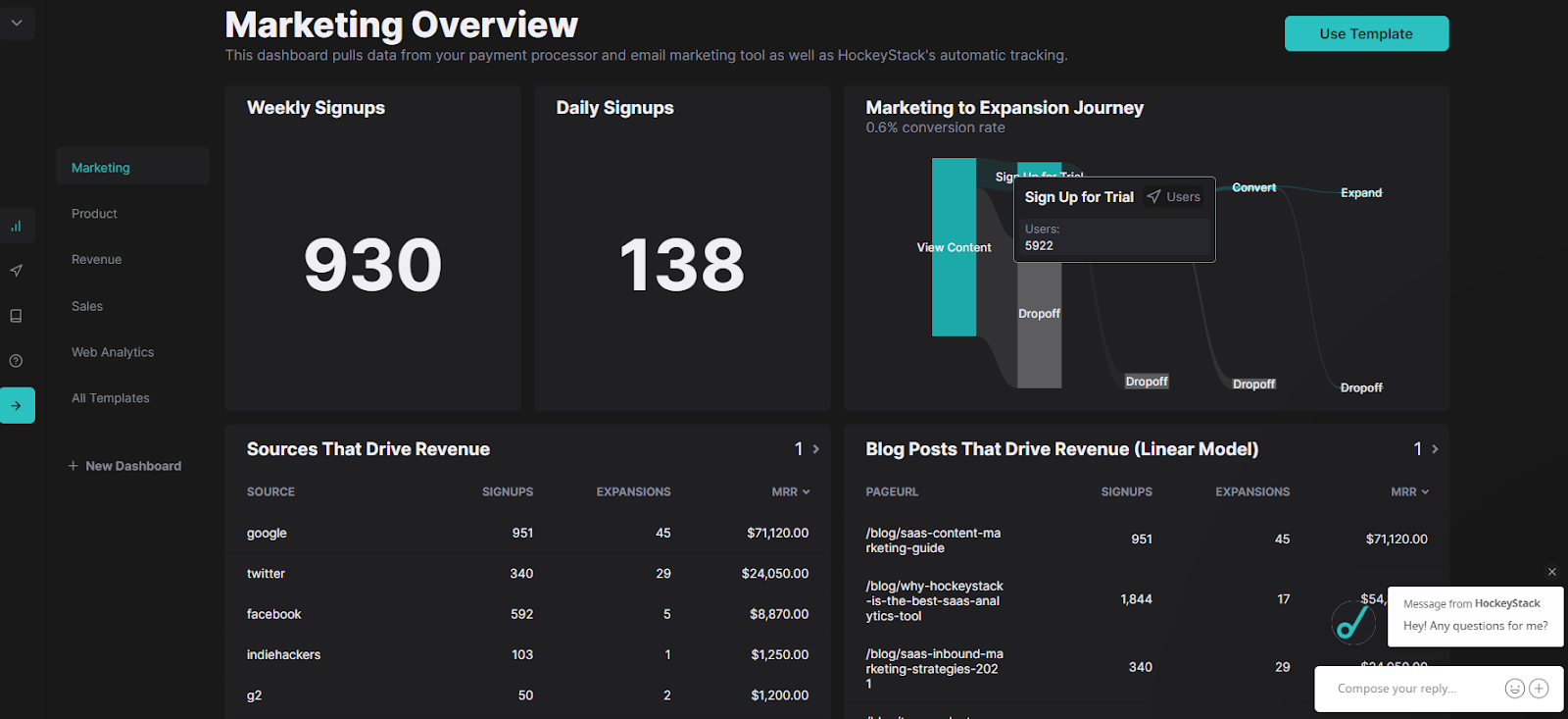
You can do this with a tool like HockeyStack where you can get feedback and understand what people really think by creating and conducting in-product/website surveys in seconds.
As I mentioned before, your UI is the way your users interact with and experience your business. By creating a seamless UI with the key principles I explained and striving to improve it with the help of metrics and surveys, you will be able to unlock the full potential of your product.
FAQs
What are UI and UX in product management?
UI and UX are two similar but not identical parts of the product management process.
What are the general principles of UI designing?
- Place users in control of the interface
- Make it comfortable to interact with a product
- Make it intuitive
- Make user interfaces consistent