Top 7 Whatagraph Alternatives For 2022
Whatagraph is a performance monitoring and reporting tool that focuses on data analysis and visualization. Even though it can help you with many aspects of marketing analytics, it is not the only option in the market.
In this article, we will look at some Whatagraph alternatives and help you to choose the best tool for your needs and preferences.
Google Data Studio
Google Data Studio is a data visualization and reporting tool part of Google Analytics and Google Analytics 360. In other words, it is a platform that turns your raw data into information and action.
Dashboard
Google Data Studio has a user-friendly and simple dashboard that you can easily learn and adapt. Since it is part of the Google network, it resembles Google Drive’s dashboard. This makes it easier for users to understand how they can operate on the dashboard and call actions.

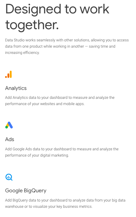
Google Analytics
Google Data Studio is an integral part and feature of the Google Marketing Platform that consists of different Google services. This means that Google Data Studio can access and utilize tools such as Google Analytics, Google Ads, and Google BigQuery. This is a huge advantage because you can manage everything in just one place without needing an outside integration.
Sharing and Collabration
Like all other Google products, Google Data Studio is designed to empower teams and increase collaboration. With the features like built-in sharing and real-time collaboration, your teams can access data and reports simultaneously and work together smoothly. This allows different departments to work together and generate detailed reports/visuals.
Pricing
Google Data Studio is a free tool offered as part of the Google Cloud Platform. Therefore, you don’t need to worry about spending extra money on data collection, transformation, and visualization.
“Unlock the power of your data with interactive dashboards and engaging reports that inspire smarter business decisions. It’s easy and free.” (Google Data Studio)
AgencyAnalytics
AgencyAnalytics is a no-code reporting software that aims to scale client reporting and grow businesses. It was founded in 2010 by Joe Kindness and Blake Acheson with the inspiration of helping marketing agencies to use their full potential.
Automated Reporting
AgencyAnalytics eliminates the need for manual labor, making data reporting quicker and easier. Without needing to spend time and energy updating every report, with AgencyAnalytics, you can use those time and effort for more fruitful actions.
AgencyAnalytics provides pre-built templates and drag-and-drop report builder features, which automate data reporting and save time in the long run.

Integrations
Integrations are an integral part of marketing analytics since they provide additional information to drive better plans. AgencyAnalytics has a great list of integrations that makes marketing teams‘ jobs easier and saves time for data collection. With more than 60+ integrations and additional integrations provided each month, you got access to all your users’ data in just a single interface.

White Labeling
AgencyAnalytics allows you to customize your dashboards and helps you to control your agency’s branding. With full white-labeled dashboards and reports, you can personalize your experience according to your branding. This makes each part of your marketing coherent and allows your branding to shine within the software.

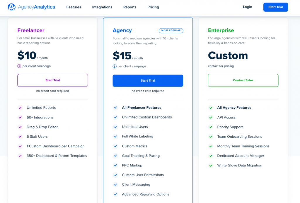
Pricing
AgencyAnalytics offers three price plans according to the per client campaign: Freelancer, Agency, and Enterprise. While the Freelancer and Agency plans are fixed plans ($10 and $15 per month respectively), the Enterprise plan is a dynamic plan. Therefore, you need to contact a sales representative to get more information and set a price according to your business.
You can also try free for 14 days without a credit card requirement.
HockeyStack
HockeyStack is an end-to-end SaaS analytics and attributon tool. It is a great Whatagraph alternative for SaaS as it unifies marketing, revenue, sales, and product data into one dashboard with no code so that you can understand what really drives revenue at your SaaS.
HockeyStack’s no-code interface and has a 5-minute setup has made it a popular choice in the SaaS space with 7000+ companies relying on the platform for their analytics and attribution needs.
With HockeyStack, you can answer inter-departmental questions that you cannot answer with any other tool on the market, such as:
- How much revenue did a certain blog series bring us?
- What is the activation rate of users from Facebook Ads?
- What is the average contract value of sales that our whitepaper generated?
- Do users that affiliates bring churn faster than users that marketing brings?
and more.
By providing answers to these questions, HockeyStack allows SaaS businesses to get rid of fragmented data and start understanding what really influences their revenue and drives conversions. Gaining a deeper understanding of everything from the top performing revenue channels and content to the customer journey allows companies to improve their strategies and get the results they need.
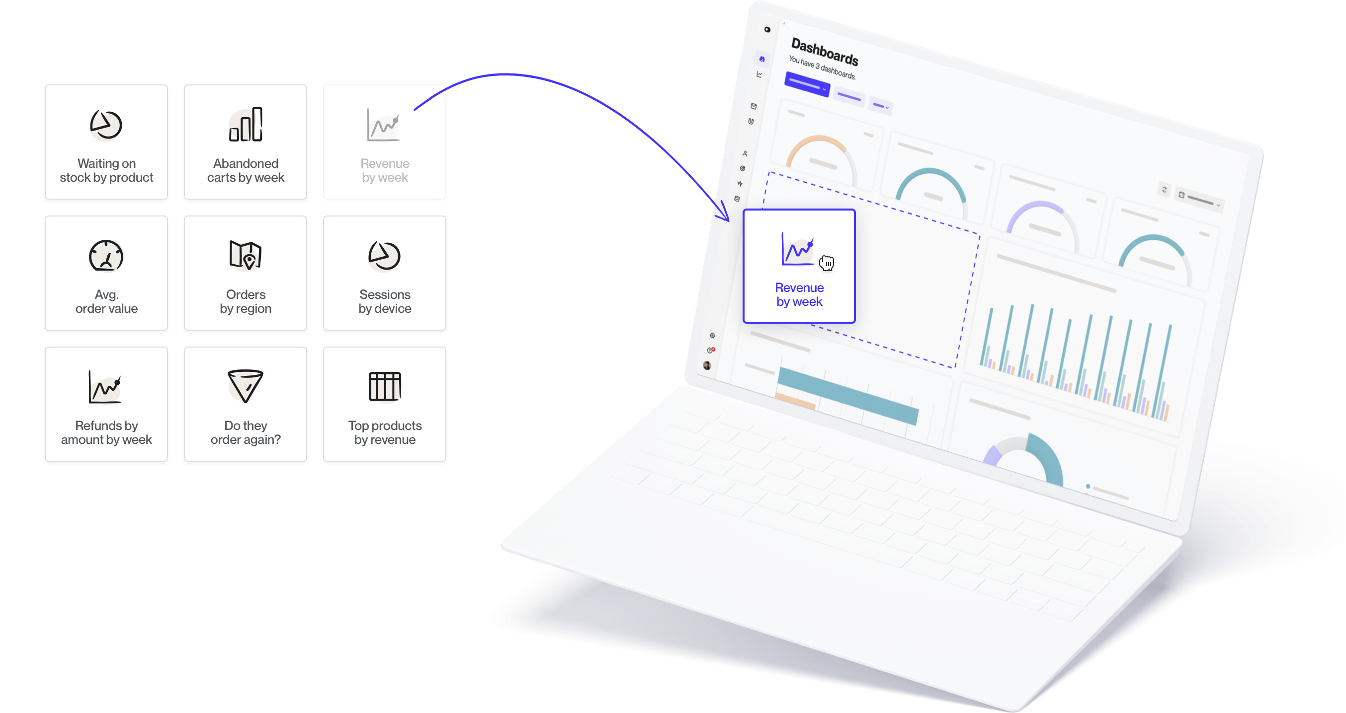
Here’s an example of what HockeyStack’s dashboard looks like:

HockeyStack’s Features
HockeyStack offers these features with no code:
- Step-by-step user journey
- Custom dashboards
- Funnels and goals
- Insights
- Surveys
- Revenue analytics
- Segments
and more
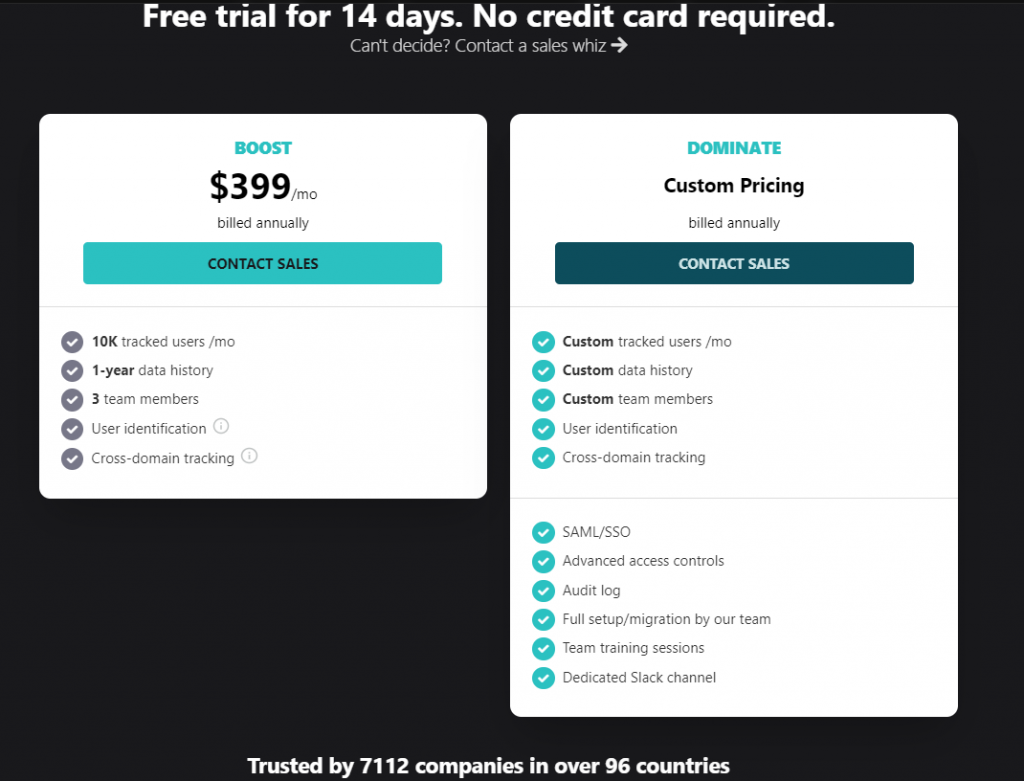
HockeyStack Pricing
HockeyStack has a two plans, both of which have a 14-day trial with a 30-day refund guarantee.
You can check out the pricing page here.
HockeyStack Summary
The unique benefit of HockeyStack is its ability to unify your marketing, revenue, sales, and product data using no code. This allows you to uncover unique insights that you wouldn’t be able to by using multiple tools as they cause you to have fragmented data.
- You can integrate with Stripe, Paddle, and Hubspot and build every single dashboard that you can think of, using all sales, marketing, revenue, and product metrics.
- You can create funnels, goals, and surveys, which are rare to get with other tools on this list.
- You don’t need any developers, tracking is cookieless, and the script is small, so it doesn’t increase your site loading time.
Autopilot
Autopilot is a visual marketing software that aims to enhance the communication between you and your customers. It helps you create marketing campaigns and manage lead conversions. Autopilot is also a multi-channel tool, meaning that it offers online, email, in-app, SMS, and traditional marketing techniques within.
Customer Data
Autopilot focuses on the relationship between you and your customers. Therefore, it can easily combine customer, transactional, and behavioral data from different sources and present unified customer profiles according to the data. This allows you to personalize your customers’ experiences and assess your strengths and weaknesses. By treating each of your customers individually, you can better understand patterns and take action quickly.
Customer Journeys
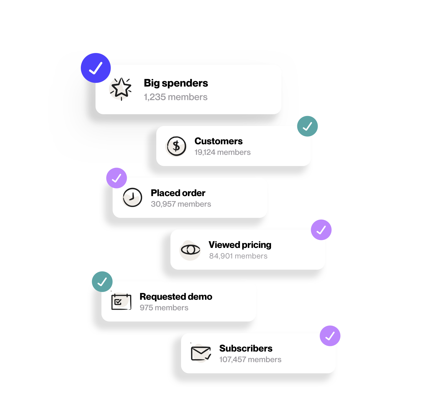
Since Autopilot deals with customer data, it tracks customer journeys and gives you insights into specific customer patterns. With Autopilot, you can easily create custom journeys to track within customer lifecycles without writing a code. You can simply use the wizard tool for building journeys. After tracking, you can also use Autopilot to segment users according to different variables.
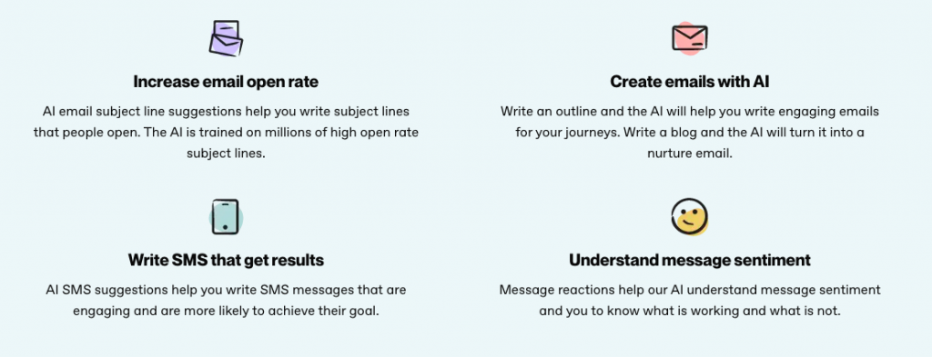
Autopilot AI
Autopilot AI is an innovative technology that saves you time and energy. It can enhance email marketing and improve SMS content. Therefore, it can easily increase engagement and improve your customer onboarding.
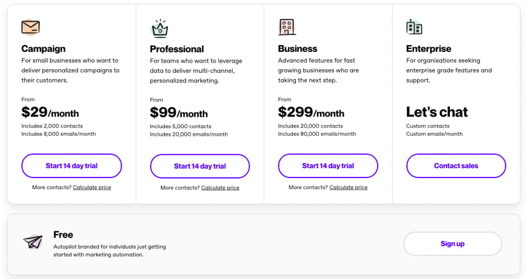
Pricing
Autopilot offers four different price plans according to the number of contacts and emails/month: Campaign, Professional, Business, and Enterprise. Whether you are a small, medium, or enterprise company, you can find a plan according to your needs.
There is also a free trial that you can try to get the feel of the tool.
Looker
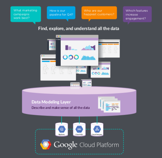
Looker is a business intelligence (BI) platform that helps you collect data from different sources to turn them into actionable insights. It is acquired by Google at the beginning of 2020, becoming one of the software of Google cloud.
With its simple data visualization process, you can create basic charts and graphs to understand your strengths and weaknesses.
Integrations
Like most other Google services/products, one of the biggest advantages of Looker is that you can integrate it with almost all Google products. Since it is a part of the Google cloud, you can easily access data from Google sources and/or use other Google products to enhance your data further. It is also beneficial if your product is mainly dependent on Google services.
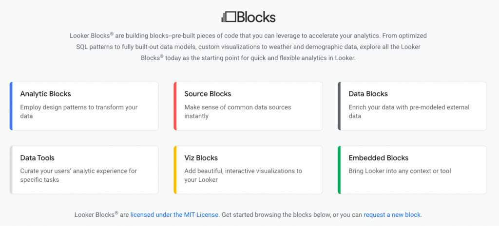
Looker Blocks
Looker operates with pre-built code blocks called Looker Blocks, which makes data analysis quicker and smoother. Since the blocks are already built, you can quickly generate actions and drive insights. It is also possible to alter these blocks to fit them into your needs and preferences.
Looker offers six types of blocks that you can benefit from:
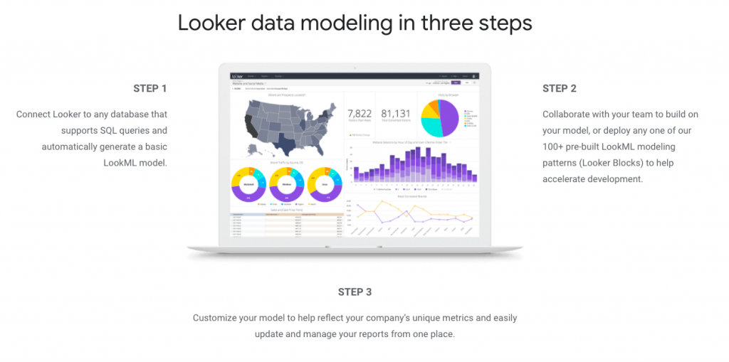
Data Modeling
After Looker gathers data, it processes data modeling in 3 steps. This allows you to thoroughly analyze data and take action according to the information presented.
- It connects to a database that supports SQL queries and automatically creates a simple LookML model that can operate within Looker.
- By using unique Looker Blocks, you can easily alter the data in hand to generate models, or you can collaborate with your team to come up with your own model.
- With features that allow you to customize models, you can integrate your needs and preferences into the models created. After, you can manage and update both the models and reports through Looker.
Pricing
Looker doesn’t disclose its price plans on its website. Therefore, you need to request a quote to learn more about tailor-made plans.
“Looker pricing can be customized for you, based on factors such as the number of users and the scale of your deployment. Pricing can be designed to fit businesses large and small. Looker’s pricing specialists can work directly with you on a pricing structure for your business.” (Looker)
Why Not Simplify Your Analytics?
Track key metrics, identify trends, and mitigate risks with greater visibility into your marketing, sales, and product data
Try HockeyStack Today
Klipfolio
Founded in 2001, Klipfolio is a cloud-based data analytics app that focuses on BI. Klipfolio gathers data into one whole and generates easy-to-understand visuals with its powerful data analytics.
Check out Klipfolio alternatives!
PowerMetrics
Klipflio operates on a system called PowerMetrics, which allows it to transform traditional BI into a modern one. PowerMetrics can easily collect data from different custom sources and accelerate data processing. It also does not require coding knowledge for importing and modifying data. Therefore, once imported, you can visualize and segment your data without any technical help.

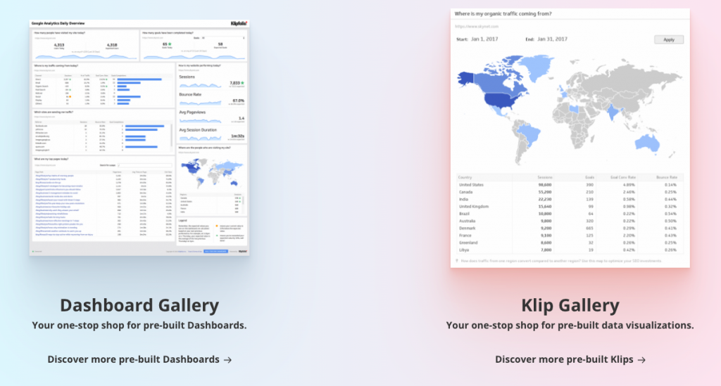
Library
Klipfolio provides its users with “Library,” which is a collection of pre-built dashboards and visualizations. This allows users to quickly start using the product and find templates that are suitable for their needs and preferences. It also allows you to easily adapt to product and get the most out of Klipfolio.
Customization
Klipfolio allows you to customize the reports and visuals according to your needs and preferences. Even though there are a lot of templates, Klipfolio is still one of the highly customizable tools in the market. With it, you can generate graphs from raw data and analyze these graphs to make data-driven plans.

Pricing
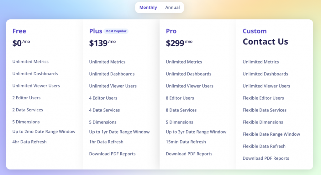
Klipfolio offers four different price plans: Free, Plus, Pro and Custom. All price plans have unlimited metrics, dashboards, and viewer users. However, the number of users, services, and dimensions increase respectively.
For the Custom plan, you need to contact a sales representative to tailor-made a plan for your needs and preferences.
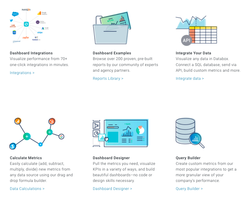
Databox
Founded in 2011, Databox is a BI tool that aims to accelerate decision-making, improve data analysis, and manage product performance. It combines data and KPIs from different sources, analyzing your product from top to bottom.
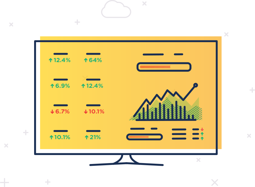
Building Dashboards
Dashboards are the crucial parts of any BI tool; they are the brain of the whole system. With a dashboard, you give commands, manage data, and generate visuals. Therefore, creating a dashboard that is both intuitive and complex is important to get the best out of any software.
With Databox, creating dashboards is easy, quick, and highly customizable. You can alter your dashboard according to your needs and preferences and get help from Databox’s templates. Databox also provides you with screens to track and manage different metrics from just one place.
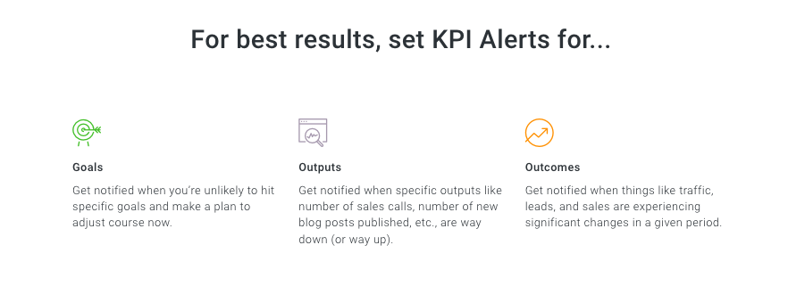
Notifactions
Databox allows you to set up notifications for specific metrics, helping you be on top of your work. These notifications are customizable according to the metric and KPI you want to track. You can also choose the goal and person for the notifications. For example, you can create a notification for when new contacts surpass X in a month, which will only notify department heads.
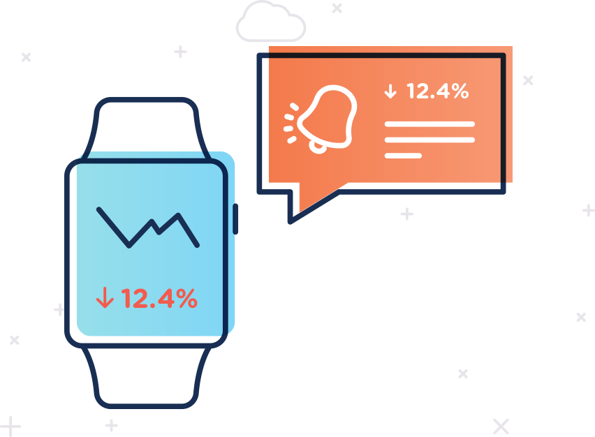
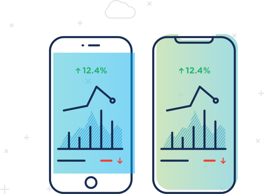
Accessibility
You can easily access Databox from desktop, mobile, TV, and Apple Watch. This allows you to track and manage all your data, reports, visuals, and other metrics with just a few clicks. In addition, you can quickly be notified through your mobile phone or watch whenever a problem occurs, which accelerates the processes for identifying and solving the problem.
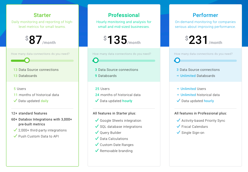
Pricing
Databox offers three different paid plans: Starter, Professional, and Performer. Prices of each plan start from $72, $135, and $231 per month respectively, and increase as the number of Data Source connections increases. There is also a free-forever plan with a restricted number of features and tools.
All the price plans below are for annual subscriptions. If you choose to subscribe monthly, there will be a 20% increase.
Conclusion
Data visualization and reporting are essential aspects of marketing and even just data collection. Without a powerful tool, you cannot turn data into actionable insights. Therefore, choosing the right tool for you is vital for your business’s growth and success.
All the tools that we have analyzed are great, but they have fundamental differences. Some are better at data collection and segmentation, while others are better at customer relationships. Therefore, to choose the best one, you need to consider what you expect from a BI tool and what you’ll benefit from the best.
FAQ
Whatagraph is a performance monitoring and reporting tool that helps data collection and visualization. It tracks campaign results across different channels and creates reports according to the data collected.
Whatagraph offers three different price plans: Professional, Premium, and Growth. They cost $119, $279, and $699 per month, billed annually respectively. However, there is a free trial that you can sign up for.