Anvilogic's Sales Performance Dashboard
How does Anvilogic measure the effectiveness and impact of their ABM and outbound activities?
What does this dashboard measure?
The Anvilogic Sales Performance Dashboard tracks key metrics to measure the effectiveness of target account lists and ABM strategies. It provides insights into account intent, pipeline per account, and the outbound performance. Analyzing these metrics helps businesses optimize their sales and marketing efforts to drive growth and revenue.
How can I use this dashboard?
- Filter Journeys by timeframe, pipeline status, or other criteria to focus on specific accounts.
- View detailed account journeys to understand buyer intent and readiness.
- Identify target accounts that have shown intent and tailor outreach efforts accordingly.
- Use the journey report to fine-tune outreach efforts and align with the interests of the TAL audience.
Anvilogic’s Sales Performance Dashboard
Hit List Journeys Report
First, this report helps you track the number of accounts from your Target Account List that have taken any actions (e.g., website visits, email clicks, or form submissions). You can filter the report by:
- Timeframe: View recent "hot" accounts by selecting a desired period.
- Pipeline Status: Focus on accounts not currently in the pipeline to identify those that should be prioritized during prospecting.
Additionally, clicking on the report provides a detailed account journey, showing all touchpoints made by each account. This feature helps you understand account intent and buyer readiness, enabling more informed and strategic engagement.

The next report shows the same data but for the last 7 days. This can be a great indicator of intent and the effectiveness of your ABM campaigns.
When the marketing team starts showing ads and the sales team begins their outreach, you should see an increase in actions. This increase indicates that target accounts are engaging with your content and showing interest in your offerings.

Accounts Showing Intent
Next, we have a report showcasing Target Accounts that visited High-Intent Pages within the last 30 days. This report includes additional data points such as:
- Date of Visit: When they visited the page.
- Lifecycle Stage: At which stage of the lifecycle they are.
- Days Since Last Sales Activity: Time since the last interaction with the sales team.
- Visited Page: Which high intent page they visited.
- URL: URL of the visited page.
- Visit Frequency: How many times they visited the page.
This information helps you understand their interests and enables the sales team to tailor their outreach based on the specific content the account is engaging with.

The next report shows the same data, but for Non-TAL Accounts which will help you identify high-intent companies that weren’t included in your ABM approach but that still falls under your ICP criteria and shows intent.

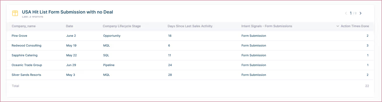
Next, we have a report showing which Target Accounts submitted the form in the last 3 months but haven’t reached the deal stage in the last 180 days. This helps you easily identify accounts that have shown interest but have not progressed in the sales pipeline, allowing you to re-engage these prospects effectively.
Then, we have the same report, but for Non-TAL companies. This helps you easily identify accounts that have shown intent but weren’t included in your ABM list.

SQL and Pipeline Data
Next, we have an overview of ABM SQLs created month-over-month for the last month, including details of which companies moved to the SQL created stage. By clicking on the company report, you can view their entire user or account journey, showing all touchpoints they have made up to now. This detailed insight helps you understand their engagement and progression through the sales pipeline.

Pipeline Creation Overview
Then, we have a report showing the pipeline created over the last 9 months, highlighting the companies that have moved into the Qualified Pipeline Stage. This report provides a long-term view of pipeline growth and helps you identify trends in account qualification and progression.

Change in Intent over time
The Change in Intent report provides insight of how the high intent actions of these companies have shifted over time, this can help you prioritize the prospecting across companies that shown change in intent.
If the account shows increased interest, this can be an indicator of them being increasingly more interested in your solution. On the other hand, if there’s a drastic decline in intent over time, seeing it early can help you implement targeted re-engagement strategies right when they are needed.

Company Journey Report
Finally, the Company Journey Report shows comprehensive day-to-day data of high-intent actions taken by TAL companies. By viewing daily activities, you can identify patterns and the frequency of engagement, offering a clear view of which days saw spikes in interest and which actions are the most common. This information helps you fine-tune your outreach efforts to align with the interests of your TAL audience.

Full Dashboard:

.avif)