8 Best SaaS Reporting Tools for 2022
Data volumes have exploded in the recent past which means it’s now necessary for companies to measure and analyze far more data than ever before. Earlier on, reporting was only done on a monthly or bi-weekly basis. This reporting frequency, however, cannot suffice for SaaS companies particularly due to their unusual business model. SaaS companies have metrics and KPIs that are far different, which is why SaaS reporting is also unlike reporting for other companies.
For this reason, it’s imperative for SaaS companies to look into SaaS reporting tools
Designed particularly for SaaS companies’ reporting needs, SaaS reporting tools are designed to integrate vast amounts of data, come complete with a large number of features including data visualization, and are known for easy-to-use interfaces for convenient reporting. These reporting tools can help a SaaS business identify problems with the customer experience, track the customer lifetime value and monthly recurring revenue of each channel, and figure out which referrers bring in the highest revenue among a number of other things that are critical for companies to track in the data-driven age of today.
In this article, I’ll go through the features and capabilities of some of these tools, share information on their pricing, and even provide you with a guideline that will be really useful in your quest for a SaaS reporting tool.
1. HockeyStack
HockeyStack is a SaaS analytics and attribution platform trusted by 7000+ companies.
HockeyStack is the only platform that can unify your marketing, product, revenue, and sales data to uncover what drives revenue.
HockeyStack tracks everything automatically on your website and product using a cookieless script with no code and a 5-minute setup time. Once the tool has been set up, you can connect HockeyStack to your marketing tools, CRMs, and payment processors to get complete visibility into anything from customer behavior to the top referring channels.
The dashboards are completely customizable which means that you can build any dashboard you need with key SaaS metrics from different departments and use accurate analysis for decision-making.
Pro Tip:
Cick on any image to see it live!
For example, you can build a churn by the blog post user signed up report:

A report to measure the exact revenue you get from blog posts:

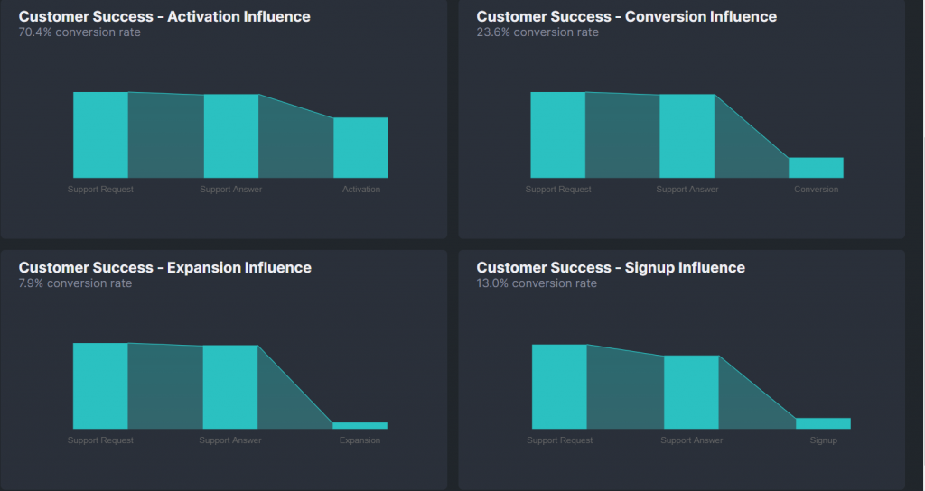
Reports to measure customer success team’s effect on growth:
A trial to expansion funnel:

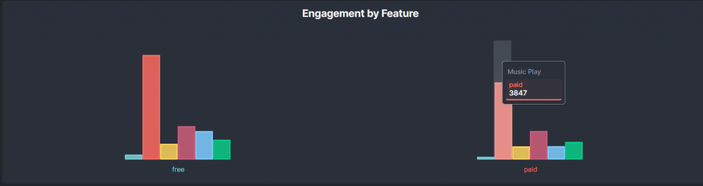
An engagement by feature report:
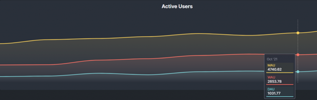
Or an active users report:
On top of custom dashboards, HockeyStack has other features too, such as
- Surveys through which you can get more insight into the customer experience
- Step-by-step user journey which allows you to track everything from clicks to signups and understand what your users love
- Funnels to get complete visibility into the number of users that churn at each step
- Revenue attribution to understand what really drives revenue at your SaaS.
and more.
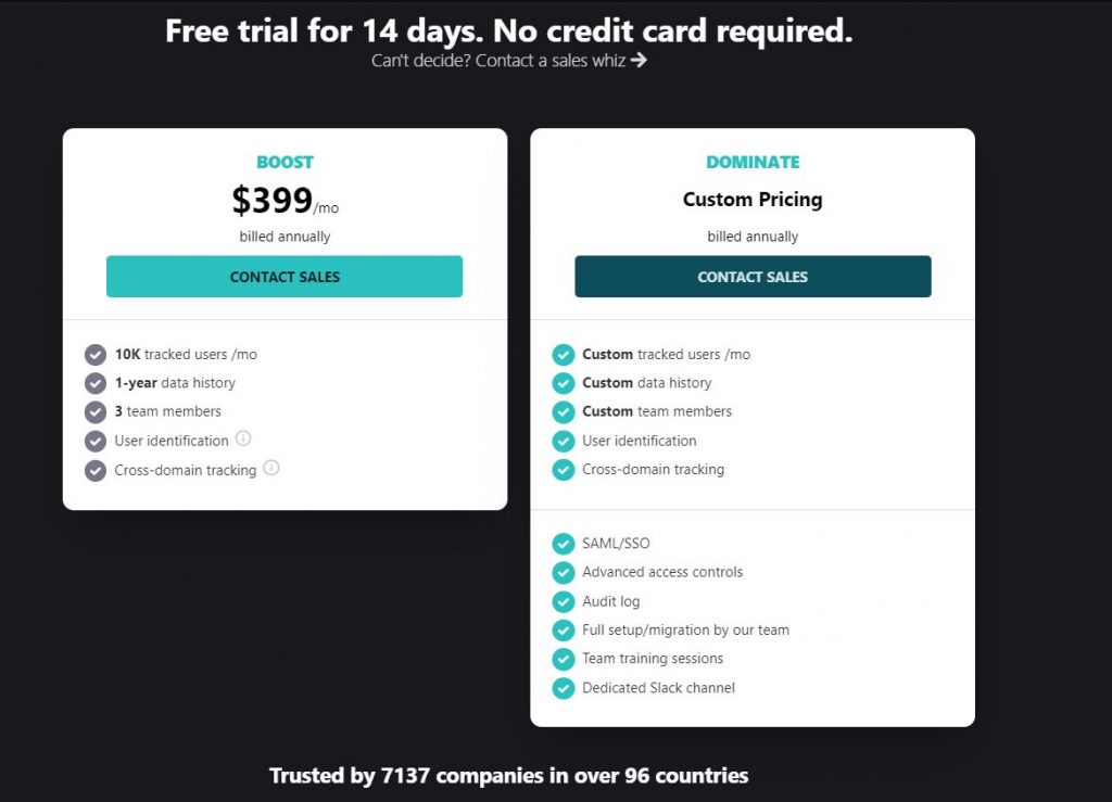
HockeyStack Pricing
HockeyStack has two different pricing plans, both of which have a 14-day trial with a 30-day refund guarantee.
You can check out the pricing page here.
HockeyStack Integrations
Here are some of the tools that you can integrate HockeyStack with:
- Paddle
- Stripe
- Hubspot
- Crisp Chat
- Mailchimp
- Intercom
- Pipedrive
- Chameleon
- Salesforce
- Zapier (coming soon)
You can view the full list of integrations here.
HockeyStack Summary
The unique benefit of HockeyStack is its ability to unify your marketing, revenue, sales, and product data using no code. This allows you to uncover unique insights that you wouldn’t be able to by using multiple tools as they cause you to have fragmented data.
- You can integrate with Stripe, Paddle, Hubspot and other SaaS platforms to build every single dashboard that you can think of, using all sales, marketing, revenue, and product metrics.
- You can create funnels, goals, and surveys, which are rare to get with other tools on this list.
- You don’t need any developers, tracking is cookieless, and the script is small, so it doesn’t increase your site loading time.
2. Databox
Databox is a real-time business analytics platform that brings all of your data together in one place so you can measure performance and uncover insights. With this reporting software, you also have the ability to combine data from several sources on a single dashboard to obtain a more comprehensive picture of your performance at a glance.
Databox is known for its hundreds of one-click connectors with Google Analytics, Salesforce, HubSpot, Mixpanel, Facebook, Shopify, and other popular platforms. With a simple drag-and-drop designer, they claim to make developing robust dashboards easier than ever.
Databox essentially consolidates all of your data from numerous sources into an one location, allowing you to monitor performance and uncover insights in real time.
Features
- Key Performance Indicators
- Data Integration
- Data Security
- Interactive Dashboard
- Predefined Templates
- Public Dashboard
- Visual Analytics
- Widgets
Integrations
As mentioned above, Databox has a noteworthy pool of integrations. Some of these integrations are;
- Chargify
- HubSpot
- Vimeo
- ProfitWell
Pros
- You can build dashboards that can be easily customized.
- Visualization tools are often simple to set up when compared to competitors.
- They feature a selection of templates from which you may select the one that best matches your needs.
Cons
- It lacks a lot of capability in various areas, particularly when it comes to client account administration.
- Customizing metrics can often be complex and complicated. Some users complained that they couldn’t establish custom date ranges.
- You are only allowed to have a certain amount of customer accounts.
- Queries are created specifically for you (which can be really beneficial). Free and basic plans do not provide this feature.
Pricing
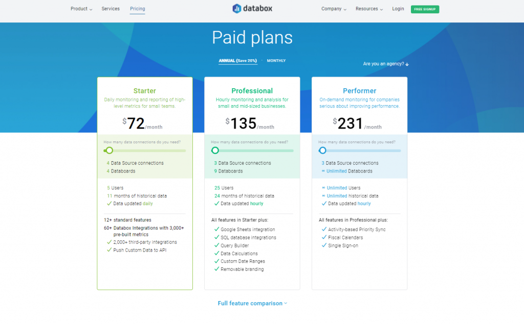
Databox has a variety of options to choose from, including a free plan and agency pricing. The free plan has a relatively restricted set of features.
3. Klipfolio
Klipfolio is a cloud-based business intelligence tool that allows users to link several data sources to generate beautiful data visualizations and make data-driven choices. Marketers may use the company’s PowerMetricks to view their data using one-click data visualizations and data exploration.
They have been successful in letting users to connect different 3rd party data sources and then examine that information through bespoke dashboards, visualizations, and reports for some time now. Marketing agencies, consultants and advisers, financial services, and software developers are among their major customer sectors.
Features
- Reporting/Analytics
- Budgeting/Forecasting
- Campaign Analytics
- Dashboard
- Powerful segmentation
- Publishing / Sharing
- Query Builder
- Data Connectors
- Data Visualization
- Key Performance Indicators
- Multi-Campaign
- Performance Metrics
Integrations
Klipfolio can be integrated with many other tools, to give an example;
- Chargify
- Stripe
- Bitly
- Google AdWords
- HubSpot
- Office
Pros
- Klipfolio may be integrated with over 100 other tools.
- They have a collection of pre-built dashboards and visualizations called Library.
- Many customers expressed their satisfaction with certain capabilities such as customization, including data sources, dashboards, and visualizations.
Cons
Klipfolio has a lot of happy clients, according to user evaluations on G2 and Capterra. Yet, some individuals have expressed their dissatisfaction with their service.
- With the basic price plan, you get a restricted number of Klipfolio dashboards (5).
- A more difficult learning curve than anticipated
- The ability to edit major chart components is limited.
- When working with CSV/Excel files, there is a 10MB data source restriction.
Pricing
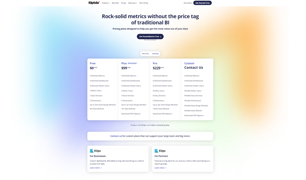
Klipfolio provides three pre-built plans and one bespoke plan to tailor the program to the specific demands of each customer. The firm provides a free plan that may be used for testing purposes. For $99/month, companies get five user accounts, ten data sources to connect, limitless metrics and dashboards, and data refresh every hour with the Plus plan. The Pro package costs $249 per month and includes 10 user accounts, 20 data connections, and a 15-minute data refresh.
4. Sisense
Sisense Reporting is one of Sisense’s high-end data and analytics tools, and it’s designed to provide quick and accurate business and operations reporting. This reporting software enables users to assemble and patch together data from various data landscapes in order to turn it into actionable insights. Sisense Reporting is also a software that can encrypt data in cloud data warehouses, supports live or cached data models for performance optimization, and creates visualizations from multiple data sources.
Elad Israeli, Eldad Farkash, Aviad Harell, Guy Boyangu, and Adi Azaria established Sisense Reporting in 2004 as part of Sisense’s business analytics products. Sisense Reporting has been the primary platform for thousands of customers, including top companies and enterprises such as Philips, Verizon and Wix, since its inception.
Features
- Query Builder
- Data Connectors
- Data Visualization
- “What if” scenario analysis
- Data filtering
- Activity dashboard
- Business intelligence
SaaS Reporting – Simplified
Generate comprehensive reports using the metric of your choice from product adoption to the best performing marketing channels
Try HockeyStack Today
Integrations
Sisense offers more than 120 data connectors, including native integrations, API connections, and authorized external connectors, to assist users gather data from a variety of sources. Some of the integration options are:
- PayPal
- Slack
- Google Drive
- Microsoft Office
- Jira
- Asana
- Dropbox
Pros
- Sisense provides on-premise and cloud-based solutions that can be understood easily by many.
- It handles huge datasets and much more integrations than its competitors nicely.
- Users may take data snapshots with Sisense’s ElasticubeTM. Users can take snapshots of their data as they transfer it into the online Elasticube to meet their lifecycle analysis requirements.
- Sisense provides customers with well-designed dashboards with useful widgets, a variety of chart styles, and insightful KPI and metrics views.
Cons
- While Sisense is often quite fast and quick-feeling, there are instances when it lags or is unresponsive for no apparent reason.
- Visuals are tricky to embed, and they don’t always function depending on where you embed them.
- The reality that on a single server, several data models (elasticube) are vying for resources (primarily RAM).
- On a dashboard, the product does not have the capacity to examine its own operating metrics.
Pricing
Sisense has an annual subscription plan, but no pricing information is available on their website. To acquire a quotation, potential users must contact Sisense’s Sales team.

5. Power BI
Power BI is a set of software services, applications, and connections that work together to transform disparate data sources into logical, visually engaging, and interactive insights. Your data may be in the form of an Excel spreadsheet or a collection of hybrid data warehouses that are both cloud-based and on-premises. Power BI makes it easy to connect to your data sources, visualize and uncover what matters, and share your findings with whoever you choose. Project Crescent was the name given to it by Ron George in the summer of 2010. On July 11, 2011, Project Crescent was made available for public download, coupled with SQL Server Codename Denali. After being rebranded as Power BI, Microsoft released it for Office 365 in September 2013.
Features
- Reporting
- Report Authoring
- Interactive Visualization
- Natural-Language Questions
- Collaboration
- Touch-Enable Native Apps
- Open, Standards-Based REST API
- Publish to Web
- Integrations and Data Sources
- Power Query
Integrations
Users may pull data from anywhere with Power BI Pro, which interfaces with both Microsoft products and third-party systems. Exchange, Office 365, Dynamics 365, SharePoint, Excel, Cortana, and Teams are some of the major Microsoft applications to which Power BI may be connected. It also integrates tools such as;
- Salesforce
- HubSpot
- MySQL
- Databases
- Amazon S3
- Facebook Ads
- Google Ads
Pros
- It contains an inbuilt ETL tool as well as solid interface with Office 365 and SQL.
- The ability to analyze text is a fantastic function.
- You may even have a positive feedback dashboard. The DAX and Power Query M languages are supported by Power BI.
- It’s a cloud-based tool, so you don’t have to set up a server or infrastructure on your own. As a result, getting into the system or creating a deployable product may be easier and less expensive.
Cons
- There are some very small or micro icons that must be moved with extreme caution. Some of the values change as you move your cursor up and down. Its user interface needs to be enhanced.
- The ability to regulate permissions and user access is currently restricted.
- Licensing might be improved. To bridge the gap between the Pro and Premium editions, a medium option is required.
- It’s a long way to the top of the learning curve. To properly utilize PowerBI’s capability, data analysts must grasp DAX (Data Analysis Expression) and Power Query M.
- You can’t use Power BI desktop to prepare data logic for your team if you use Mac devices.
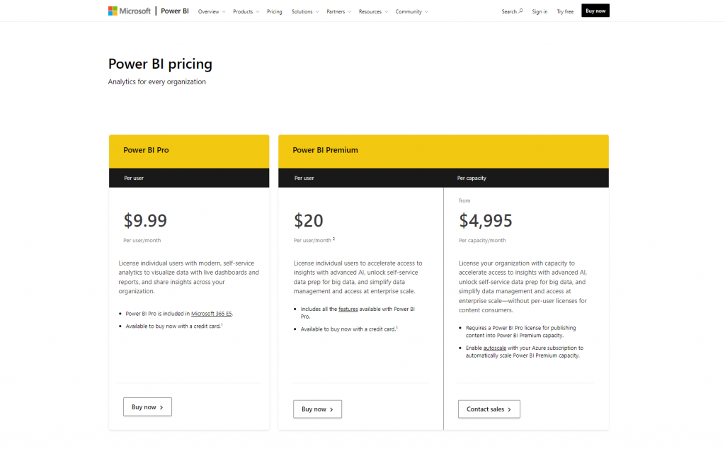
Pricing
Power BI may be downloaded for free on your local workstation for personal usage. If you want to use additional Power BI services, you’ll have to pay either $9.99 per user per month for a cloud solution or $4,995 per month for a dedicated server (cloud compute and storage resource)
6. Zoho Analytics
Zoho Analytics is a business intelligence (BI) and data analytics tool that allows users to visually examine data, generate visualizations, and gain a better understanding of raw data. It allows users to create dynamic, fully configurable, and actionable reports, as well as integrate with different platforms to gain more information. Its dashboards, which are multidimensional and customizable, can improve the user experience. Zoho Reports was the previous name for Zoho Analytics.
Features
- Graphs and Charts
- Dashboards
- Automodeling
- Advanced Analytics
- Data Visualization
- Big Data Services
- Building Reports
- Data Transformation
- Data Modeling
- WYSIWYG Report Design
Integrations
Some of the integration provided are:
- Mailchimp
- Stripe
- Shopify
- Zapier
- Pipedrive
- Zendesk
Pros
- To obtain insight into wider data trends, employees might combine various reports into a single dashboard.
- Through geo visualizations that enable comparison across and between areas, businesses may gain in-depth, actionable overviews of operations ranging from sales, finance, and marketing to resource management and geographic activities.
- Managers may use sophisticated tools like pre-built formulae and functions to discover business KPIs and smart forecasting to anticipate future outcomes to do deep analytical queries that boost their business intelligence.
- The platform’s modular, scalable design makes it easy to create and incorporate analytics into any size application. Utilizes scalable columnar database technology to scale up to organizations with large amounts of data.
Cons
- There is a learning curve that might be difficult to overcome when compared to certain competitors.
- It might be difficult to alter or customize formulas.
- The first setup could be more dynamic.
- When compared to other dashboard systems, it is difficult to use.
- Connections to non-Zoho sources using the API are unreliable.
- It’s a little tough to edit data on reports, but the inclusion of more tools might help.
- It’s not always easy to share reports.
Pricing
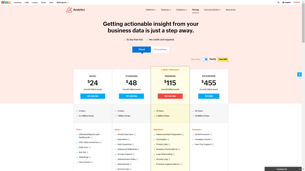
The monthly cost of Zoho Analytics starts at $24. Basic, Professional (On-premise), Standard, Premium, and Enterprise are the five various options offered by Zoho Analytics. Zoho Analytics also has a limited-featured Free Plan.
7. Holistics
Holistics is a cloud-based business intelligence platform that includes data reporting and preparation capabilities. The tool is SQL-based and allows companies to connect numerous SQL databases, execute ad-hoc queries, forecast trends, and display data. For routine inquiries, their system generates reports automatically on a regular basis. The data inside the reports may be customized as required, and the reports themselves are customizable. The Holistics dashboard uses dynamic charts and graphs to aggregate and visualize data from several reports. It also includes options for setting threshold events notifications, reporting concerns, and sending reports to other users through a shared link. Holistics was launched in April 2018.
Features
- Reports and Graphs
- Metrics
- Custom filters and query templates
- Access authorization controls
- Email schedules
- Embedded dashboards
- Shareable links
- Auto update mode
- PDF dashboard
Integrations
Some of the integration options are:
- MySQL
- PostgreSQL
- Amazon RDS
- MariaDB
- Amazon Redshift
- Snowflake
- Presto
Pros
- Data aggregation from numerous sources is supported by Holistics (Spreadsheet, Google Analytics, MongoDB, etc.)
- Non-technical teams may use self-service analytics with a simple drag-and-drop interface to address adhoc data requests.
- Email/Slack schedules and alerts, as well as shareable links, provide powerful distribution possibilities.
- Their customer service usually responds quickly.
- It is compatible with practically every major database on the market (PostgreSQL, MySQL, MS SQL, Snowflake, Amazon Athena, Google Big Query, etc.)
Cons
- The main disadvantage is that the drilldown feature is not present, like it is in Power BI.
- In Holistics, creating Timeseries filters and dropdowns takes longer. Which needs to be improved.
- There isn’t much interaction.
- When a big dashboard with a broader bar graph is distributed to users, a few bar lines are shrunk, causing confusion. If you could better address this, it would be fantastic.
- It is not as comprehensive as some other solutions, but this will not be an issue for most people. What you should keep in mind is that the queries are run on your server, putting some strain on your database.
Pricing
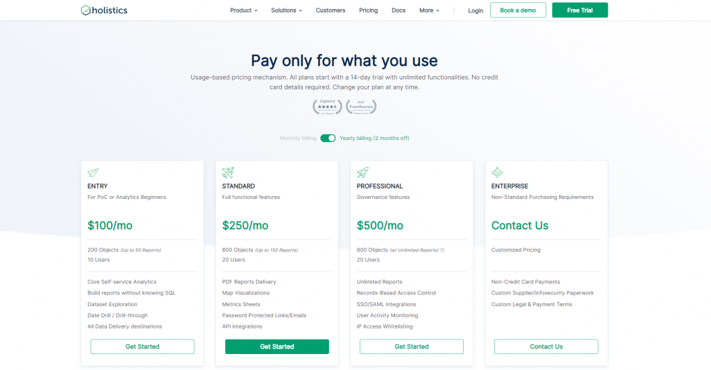
Holistics charges you depending on your consumption (or query runs) rather than the number of users, which appears more inexpensive and scalable. You may use Holistics for free, but only for a restricted number of query runs each month.
8. Google Data Studio
Google Data Studio is a popular choice among the free dashboard and reporting systems. It links to all Google properties as well as other third-party data sources with ease. Many firms will collect data using Google Analytics and then analyze it using Google Data Studio’s interactive dashboards. The imported data may be viewed in a variety of dashboards, and then visualizations can be created to aid in the discovery of intelligent insights.
Features
- A nifty dashboard
- Multiple data collection sources
- Performance driven in-memory BI engine
- Interactive data visualization
- Real-time collaboration
- Ease of use
- Report scheduling
Pros
- Google Data Studio allows you to create an infinite number of tables and pages. To make things easier, the pages can be labeled by category or subject. It also allows for an endless number of dimensions and metrics.
- Google Data Studio is known for its speed and ease of use. It’s primarily due to the fact that Google Data Studio and other Google services are linked.
- Google Data Studio generates reports that customers may simply edit. There are enough possibilities here to play with with different colors, fonts, sizes, labels, and borders.
- Clients or executive teams may dive further into your analysis using filters and display choices, and the metrics are constantly up-to-date thanks to real-time integration.
Cons
- Self-service data exploration options are limited.
- There isn’t a way to automatically refresh data. You’ll need to install a third-party browser plugin if you want real-time data (like this one)
- If your data source isn’t owned by Google and you need to link it with Google Data Studio, you’ll need to write additional SQL code or do ETL.
Pricing
Google Data Studio presently has only one version, and it is free, similar to Google Sheets, which is free to create, edit, delete, share, collaborate, and so on.
Conclusion
There you have it, an in-depth examination of the available SaaS reporting tools. With the information provided in this article, you can choose which tool would be the best fit for your business and data requirements. Each of the aforementioned reporting tools has its own set of advantages that will help your company or organization collect, analyze, and report data more effectively, as well as drawbacks that will take up more time and money. So, remember to refer to this guide and weigh out the pros and cons of the reporting software you are considering before settling on one.
For any fast-growing business, growth-oriented KPIs and timely data analytics and reporting tools are critical. When compared to alternative “on-premise” software, SaaS reporting as an analytics solution offers numerous advantages, including cheaper prices, less complexity, and quicker deployment.
Through a cloud-based application, SaaS analytics tools provide sophisticated data analytics solutions such as beautiful reports and interactive dashboards. To provide reporting and dashboard services to businesses, Saas reporting systems often use subscription-based pricing.
The revenue growth rate of a SaaS firm, which is likely the most crucial indicator for assessing its success, is measured using specialized metrics in SaaS reporting. It keeps your SaaS company on track for growth and ensures you know where you stand at each stage.
Yes, it very certainly can. Understanding how your prospects become customers and linking that data across the customer lifecycle is essential for proper growth. Recognizing more data will eventually lead to growth and, consequently, more revenue.
A software dashboard that organizes critical SaaS KPIs from sales, marketing, finance, support, and development teams to provide executives a bird’s-eye perspective of the organization is referred to as a SaaS dashboard.