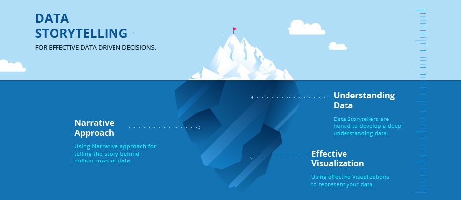
5 Elements of Effective Data Storytelling
Everyone involved in SaaS is talking about the importance of data. “Use data for forecasting,” “the role of data in optimization,” “data-driven insights”…Businesses seem to know that they have to use the information they have. Then why are 40% of companies still not using data analytics?
One of the biggest reasons is that data can be confusing. Having access to countless metrics and numbers doesn’t make analysis easier. What makes it easier is using an old, reliable, and easy way of communication: storytelling.
What is data storytelling?
Data storytelling is the process of explaining insights obtained from data via visualizations and narratives. It uses the key elements of storytelling to make data digestible, which include the setting, characters, conflict, and resolution.
- Setting: the period that the data is collected and the times when the trends happen.
- Characters: the players and the stakeholders that are involved.
- Conflict: the issue or the goal in mind while analyzing data.
- Resolution: proposed course of action based on the data.
Let’s analyze an example to see these elements at play.
Say that your company has seen an increase in its churn rates. Careful analysis showed that the churning companies are small companies and startups with limited budgets. The upwards trend in your churn rates started when you changed your pricing strategy from tiered to usage-based.
Now, if you had taken the churn graph to a meeting and said that you need to change your pricing strategy once again, your audience would naturally ask you why. Without the key elements above, you wouldn’t sound as convincing. So, you decide to show the importance of this trend and its meaning via storytelling.
The story takes place in the first quarter when the upward trend started. The characters involved are small companies, startups, and of course, your business. To depict the characters, you can name some of the companies that have churned, put forward their customer profiles and talk about what they have in common. This way, your audience can start seeing the association between company size and churn.
Now comes the conflict: you’ve made a change in your pricing strategy, and it’s causing you to lose a part of your customer base. This is leading to a loss of revenue. To emphasize the importance and urgency of the matter, you should use visual elements such as graphs and charts. In this case, you can use a monthly churned revenue graph to show that the change in your pricing strategy is doing more harm than good.
While such holistic views are helpful, it’s also beneficial to look at individual reasons and motivations behind the conflict. For instance, what was company X, a startup that has recently churned, saying on its churn survey? How did the new pricing affect their budget? These questions help zoom in on individual characters in your story.
Finally, you’re ready to come to the happily-ever-after part of your story: the resolution. What do you think should be done to fix the issue? Do you think you should return to the previous strategy or try another new one? Which trends in data make you think the way you do? These questions will outline the plan you will follow in the upcoming months.
Couldn’t I have done all this with a single graph? you may ask. Maybe you could, but your job would be much more challenging because visuals can’t replace storytelling.
Is data storytelling the same thing as data visualization?
As I’ve implied, the short answer is no. Visualization is an essential aspect of data storytelling, but it’s just one element in the process. This is because visuals alone cannot explain the characters, setting, conflict and resolution if they’re not coupled with narratives.
Let’s continue with the same example to show how this is the case. Think of a graph of your increasing churn rate and decreasing revenue. They are not self-explanatory. If you don’t draw out the narrative, the audience won’t understand that the churning companies are mostly small businesses, they won’t directly see how the timing on the graph corresponds to the change in your pricing strategy. They may even come up with alternative explanations for the increase in your churn rate. For instance, they can argue that the increase is due to the entrance of a new, strong competitor into the market.
With data storytelling, you give context to visuals and help your audience understand the insights you’ve got from the trends. You also convince them that the trends do signal the associations you’ve made. This helps you prove that the solutions you provide may work.
If you don’t believe that a simple narrative could be this beneficial, maybe scientific explanations can persuade you.
The psychological importance of crafting a narrative
Your brain is processing countless forms of data as we speak. Not all of this can be stored (it would be inconvenient if we remembered literally everything.) So, you’re unconsciously selecting the information that will be stored and that which will be discarded.
So, how can you ensure that the information you’re presenting doesn’t go through one ear and come out the other? The best way of making data memorable is by engaging multiple parts of the brain. Storytelling is very effective at this, and that’s why cognitive psychologist Jerome Bruner says that people are 22 times more likely to store information when it’s presented in a story. When you hear a story, multiple parts of your brain are engaged.
- Wernicke’s Area, the portion that controls the comprehension of speech,
- The Amygdala, which is involved with experiencing emotions,
- Mirror neurons, which help us empathize with others,
and more.
When these many parts are engaged, the hippocampus is much more likely to convert information into long-term memories, meaning that the data, the conflict, and the resolution you’ve presented will stay in your audience’s mind.
You should notice that I’ve said it’s likely for the hippocampus to convert information; not certain. Not all stories will leave an impact on the listener’s mind. To maximize your chances of getting this very result, you should know about the five key elements of compelling storytelling and incorporate them into your narratives.

5 elements of effective data storytelling
1. Compelling data
You can’t just put all your dashboards into a Google slide and hope for the audience to find the data you’re talking about. You must use the metrics and data related to the conflict, characters, and resolution. That’s why it’s essential to know the case you’re going to make with your story before crafting it.
Let me use the example of increasing churn rates again to illustrate this. You know that you’ll use a graph of increasing churn–that graph led you to a story in the first place. But you can’t use just one graph to make a case. You must also show the data that signals an association between company size and churn rate and revenue and churn rate. You know that you’ll need these visuals because you already know about the case you’ll make (higher churn due to a change in pricing, mostly affecting small companies.)
Picking supporting data makes your case more compelling and leaves readers convinced.
2. Use of visuals
Now that you have the proper data, you need to help your audience see what you’re seeing.
Your visuals need to highlight the trends you’re mentioning in your story, and show the associations you’ll mention. You need to keep in mind design principles while crafting funnels, graphs, and charts so that the visuals are both aesthetically pleasing and engaging.
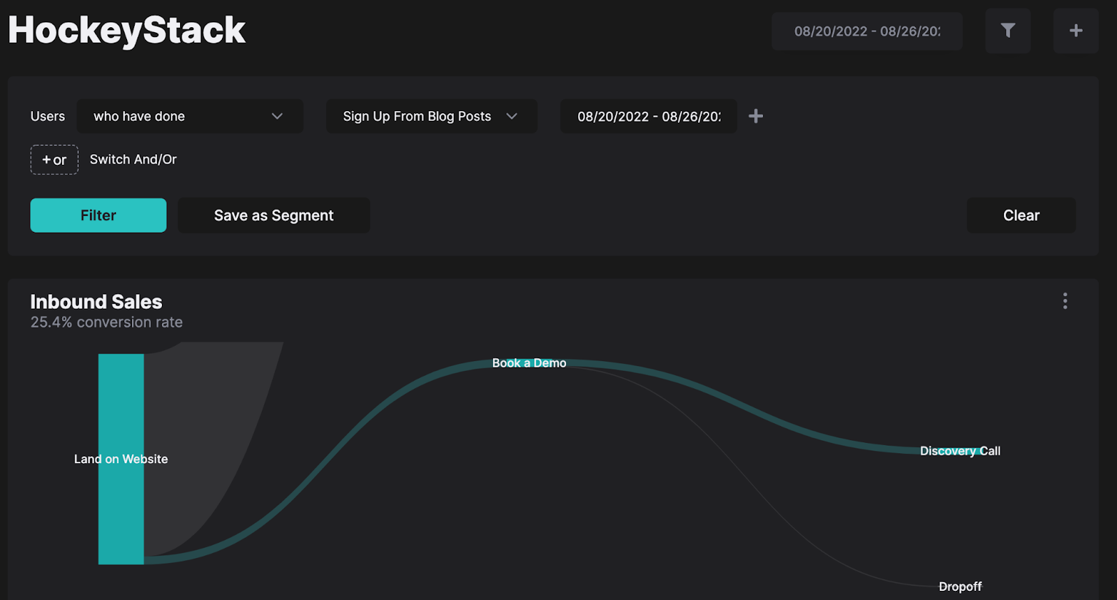
How do I find such visuals? Do I need to create them from scratch? you may ask. Not if you use a data analytics tool like HockeyStack, which lets you create any visual with the data you want to see.
3. Enough context
You can’t leave out any of the elements of a proper narrative. The setting, characters, conflict, and resolution all serve a purpose. So, for instance, even if your data doesn’t show a negative conflict, you shouldn’t leave the audience hanging and have a resolution. If the data had shown that your new pricing strategy was working, you wouldn’t just say it’s working and leave it at that. Your resolution would say that you should continue with the change and even propose further improvements.
4. Incorporating design thinking
You have your story, your data, and your visuals. But you can’t go in front of your audience without testing your presentation and putting yourself in the listeners’ shoes. These two steps are a part of a three-principle concept called design thinking, a process designers use to visualize and present information.
These three principles are also known as the 3 E’s: empathy, expansive thinking, and experimentation. Empathy means thinking of your audience and how much they know or don’t know. For instance, if you’re an IT technician talking to your executives, you should probably refrain from using too much technical jargon.
Expansive thinking is looking from different perspectives. You can do this to get feedback by testing your story in front of a different audience for a test run.
Lastly, experimentation. Don’t assume that your story is perfect, be open to feedback and changes.
5. Appealing to the audience’s emotions
While telling your data’s story, try to appeal to your audience’s emotions. They probably won’t remember the statistics or the graphs, but they’ll remember the way they felt when you told them about the conflict and possible resolution. As Maya Angelou once said, “people will forget what you said, people will forget what you did, but people will never forget how you made them feel.”
Key takeaways
If you want to make a propelling case, data storytelling is the way to go. By engaging multiple parts of the listener’s brain, storytelling helps them create long-term memories. To craft engaging and memorable stories, make sure you use the key elements of storytelling, data, and visuals. Keep your audience in mind and remember to appeal to their emotions.
FAQ
Data visualization makes data digestible via charts and graphs, but it doesn’t give it context. Data storytelling uses visuals to explain insights gained from data.
By explaining the characters involved, the setting of the data, the conflict that it signals, and possible resolutions.