6 Best Domo Alternatives For 2022
Business intelligence (BI) and data visualization are essential processes for the decision-making and growth of your business. They help you collect, analyze, and display data to turn it into insightful actions. Without these processes, data is merely a collection of mysterious numbers. However, with BI and data visualization, data becomes valuable information that can enhance your business.
In this article, we will look at Domo, a BI tool, and its alternatives to give you a better understanding of what each tool offers and how you can decide which one is the one for you.
Domo
Domo is a fully mobile, cloud-based software that specializes in BI and helps you to enhance your data visualization. With Domo, you can access data from different sources, automate data pipelines, and analyze data.
The most important features are:
Data Integration
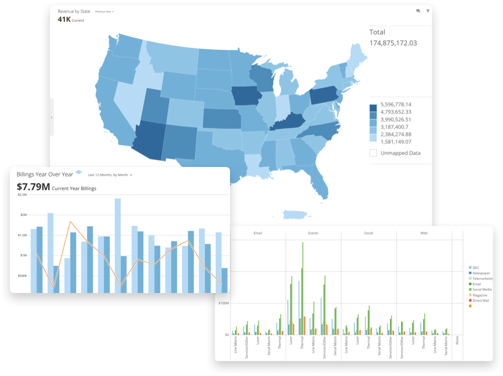
What sets Domo apart from other BI tools is its ability to integrate data from different sources and combine these data to generate real-time and predictive visuals. Domo offers more than 1000 pre-built data connectors that help you access data libraries and collect the intended data.
Since Domo is a cloud-native BI, the data sources are not just limited to on-premise sources but any source that you can think of, Google Analytics, email, CRM being a few. Then, you can easily transform any data into valuable visuals.
Fully Mobile
Domo focuses on making data available anywhere and anytime. Therefore, it works fully on mobile, and customers can reach their dashboards easily with just a few clicks. This also means that you can manage and analyze data from your mobile phone and take action quickly without losing time with frivolous processes.
Domo also automatically updates user data and shares these with every team member who can access data through their mobile phones. Therefore, communicating and strategizing through Domo is quick and easy.
Data Transformation
Domo combines and transforms with several techniques and languages, which widens what you can achieve with just one tool. It offers Magic ETL and SQL dataflows (supported by MySQL and Redshift).
Magic ETL is a unique, simple drag-and-drop interface that allows users to cleanse and combine complex data from different sources without prior SQL knowledge. In addition, you can directly set up data pipelines through Domo by writing MySQL or Redshift. These methods can help you transform and display data the way you want.
Reviews
Domo got 4.2/5 stars on Capterra out of 193 reviews and 4.4/5 stars on G2 out of 628 reviews.
Some positive comments were:
“Within days we had integrated our CRM database, Website Analytics, Invoicing database, and Order Processing database. This let us take a look at EVERYTHING. And I mean everything. Things like: What’s the average time between receiving a lead and the rep calling them the first time? What’s the average time between a customer ordering, and reordering? How many calls have my reps made today? (Updated every 15 minutes!)”
“Domo enables as to give a live 360 degree view on our business and makes data accessible and visible to everyone in the company. It’s not just about visualization of KPIs and other data. You can take the data and turn it into actionable steps.”
“Domo was a great product for us to trim our costs, move everything into one centralized system and make data accessible to more of the team. We were able to cut development time and costs since Domo requires no special knowledge like how to program in R or Python.”
On the other hand, there were also some negative reviews:
“My worst experience with domo was with their customer service/integration team. One of their prebuilt integrations to a popular Web App, which domo is responsible for maintaining and servicing, has never functioned properly with our domo instance. The support case has been open for nearly a month and has just been escalated to someone that appears to know how to read the code I have been sending them to trouble shoot THEIR integration.”
“The standard contract is reasonable but many features and apps are an expensive add-on. Any customization or support not related to performance of standard features is not included with contract.”
“Most of the connectors that we tried to work with were barely demos – totally unfit for purpose – so unless you have a team of SQL coders to build everything by hand, or are prepared to pay Domo’s extortionate professional services fees (which you’ll need to book weeks in advance), you should avoid this product as they won’t help you.”
Pricing
Domo does not disclose its price plans on its website because each plan is tailor-made to customers’ specific needs and preferences. Thie repricing is based on several components related to the platform’s usage, such as data storage, data refresh rates, the volume of data queries, the number of users, etc. It also offers a free trial, so you can create a demo account and test the tool out.
HockeyStack
HockeyStack is an end-to-end analytics tool for SaaS companies. It is a great Domo alternative for SaaS as it unifies marketing, revenue, sales, and product data into one dashboard with no code so that you can understand what really drives revenue at your SaaS. It’s completely no code, and it doesn’t require any setup.
With HockeyStack, you can answer inter-departmental questions that you cannot answer with any other tool on the market, such as:
- How much revenue did a certain blog series bring us?
- What is the activation rate of users from Facebook Ads?
- What is the average contract value of sales that our whitepaper generated?
- Do users that affiliates bring churn faster than users that marketing brings?
and more.
By providing answers to these questions, HockeyStack allows SaaS businesses to get rid of fragmented data and start understanding what really affects their revenue.

HockeyStack’s Features
HockeyStack offers these features with no code:
- Step-by-step user journey
- Custom dashboards
- Funnels and goals
- Insights
- Surveys
- Revenue analytics
- Segments
and more
HockeyStack Pricing
HockeyStack has a free forever plan and 3 paid plans. Paid plans have a 14-day trial with a 30-day refund guarantee.
You can check out the pricing page here.

HockeyStack Integrations
- Paddle
- Stripe
- Hubspot
- Pipedrive
- Mailchimp
- Salesforce (coming soon)
- Zapier (coming soon)
HockeyStack Summary
The unique benefit of HockeyStack is its ability to unify your marketing, revenue, sales, and product data using no code. This allows you to uncover unique insights that you wouldn’t be able to by using multiple tools as they cause you to have fragmented data.
- You can integrate with Stripe, Paddle, and Hubspot and build every single dashboard that you can think of, using all sales, marketing, revenue, and product metrics.
- You can create funnels, goals, and surveys, which are rare to get with other tools on this list.
- You don’t need any developers, tracking is cookieless, and the script is small, so it doesn’t increase your site loading time.
Sisense
Sisense is a BI software designed to analyze big data sets more fluently and effectively. Sinsense highlights that “[it] is powerful enough to tackle big and disparate datasets, but simple enough to be used by almost anyone.”

Single-Stack Architecture
Sinsense is one of the BI tools that is based on single-stack architecture. This means that Sisense works on just a single system (stack). Therefore, data preparation, analysis, and visualization take place in just one place, ensuring quick and effective solutions. The single-stack solution automates data modeling, connects different data sources, and enables exploration between these sources.
Artificial Intelligence
Sisense is built on artificial intelligence (AI), embedded in every integral part of the tools. It is an especially crucial aspect of data analytics. Their AI ensures that data is collected accurately and analyzed thoroughly. Also, it gives the flexibility to handle big sets of data and transform them into actionable insights.
Data Integration
Sisense collects data from different sources through its impressive AI and seamlessly integrates them into one cohesive whole. It is easy to import and blend data according to your needs and preferences. In other words, with Sisense, you can fuse your use cases, business objectives, and technical requirements in one strategy to manage your data.
Reviews
Sisense got 4.5/5 on Capterra out of 357 reviews and 4.3/5 on G2 out of 630 reviews.
Here are some positive reviews:
“Sisense is easy to install and setup. It easy to use, both on the data modelling and dashboard design aspects. It makes it the perfect tool to quickly set up added value dashboards and begin your shift towards understanding your data. Sisense is also easy to embed and therefore makes it easy to provide our users with self-service analytics.”
“We really liked the fact that sisense is a “full-stack” BI tool so we could keep a separate reporting data store without having to pay extra fees for SQL licensing.”
“The Elasticube is at the core of the SiSense product – it allows an administrator to connect to multiple disparate data sources to create a logical grouping of data. The dashboards are attractive and functional.”
And there were also some negative reviews:
“Product lacks good support for multi-organization deployments: Sisense is tailored very much to be a large enterprise type of application, so deployments involving multiple sets of customers require additional development cost.”
“One of the issues we ran into was becoming dependent on plugins and non-standard setup procedure to support our unique needs. As our system grew, it was difficult to find reliable support people to work with us on the Sisense side. The support team did not have the technical expertise I would expect for such a complicated product, so we ended up learning a lot on our own and solving our own problems.”
“While Sisense is mostly really responsive and quick feeling, there are unexplained times of lag or unresponsiveness. Embedding visuals is difficult and they don’t always work depending on where you are embedding them.”
Pricing
Unfortunately, Sisense doesn’t disclose its price plans on its website. Therefore, you need to request a quote through a form. However, the good news is that before purchasing the product, you can try the tool for free and get a sense of it.
Looker
Looker is a BI tool that helps you manage and transform data into valuable visuals. It is an excellent tool for basic data visualization, and with it, you can easily collect data and generate graphs.
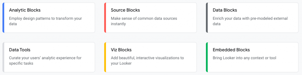
Looker Blocks
Looker blocks are unique pre-built pieces of code that enhance data analysis, which separates its data analytics from tools like Tableau. They help you to easily and quickly set up actions and generate visuals. Looker offers these blocks in six different categories: Analytic, Source, Data, Data Tool, Viz, and Embedded Blocks. Each of these serves different uses and can be customized according to your needs.
Embedded Analytics
Looker’s embedded analytics feature helps you accelerate the data collection and visualization processes. With Looker, you can access live metrics and dashboards without having to worry the data is accurate and precise. You can also easily build data apps faster, create a better user experience, reduce development costs, generate new revenue streams, and build workflows.

Accessibility to Google Products
Looker became a part of the Google network after Google acquired it at the beginning of 2020. Therefore, Looker can access Google products/applications, making it easier for users to combine and collect data from the Google cloud. It also means that Looker has an impressive list of integrations that consists of Google products/applications. This is a huge advantage if your product/service mainly works on the Google network. Even if it isn’t, this can help you access tools beneficial tools that can enhance your product/service.
Reviews
Looker got 4.6/5 on Capterra out of 141 reviews and 4.4/5 on G2 out of 1,068 reviews.
Some positive reviews were:
“Logging in the first time is simple and straightforward. I also had good experiences with chat support to solve small access and navigation issues.”
“It’s great at getting an overall view of where my team stands budget wise and being able to break it down as much as needed. I love that I’m able to see performance statistics in real time.”
“Modeling platform which allows the me to codify data visualization using a proprietary modeling language. The self-service visualization tools that allows end users to access the benefits of data analysis. Looker has one of the best user interface on market very easy to use and in my organisation it very useful because it saves time and costs of training.”
Some negative comments were:
“It gets down very often, requires very good internet connection and building dashboards is not very easy and intuitive for non professionals, requires time to get used to it.”
“Can be a little heavy lift to create everything and make sure you push correct data. It does occasionally loose connection with data source.”
“You do need a good BI person or ETL developer to really get the most out of this tool. Setting up your data model really well and going to the outer limits to solve some particularly difficult queries are all things I would have had a hard time doing without technical resources on the team.”
Pricing
Looker doesn’t disclose its price plans on its website. Therefore, you need to request a quote to learn more about tailor-made plans.
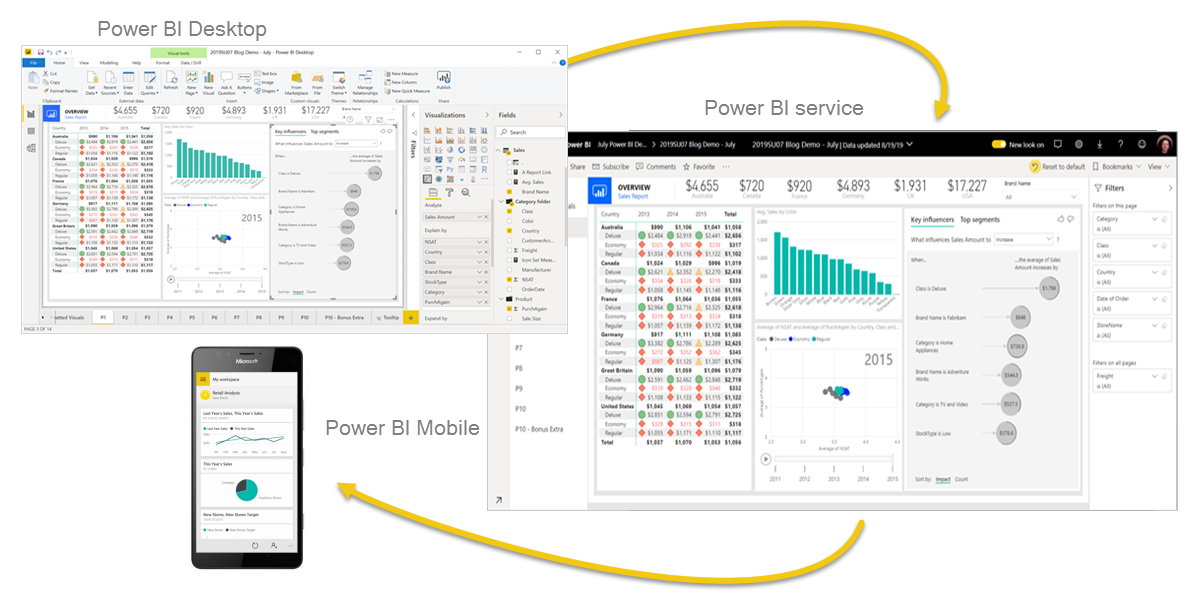
Power BI
Microsoft Power BI is a collection of apps, software services, and connectors to transform your data into valuable information. With Power BI, you can create interactive and immersive visuals with the data collected and take actionable insights.
Check out Power BI alternatives!
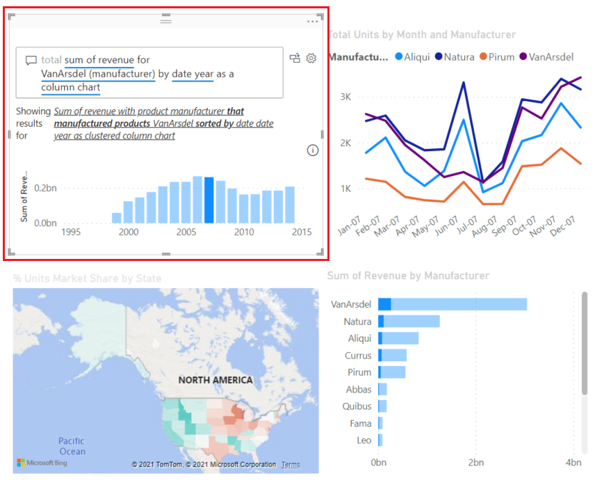
Range of Visualizations
Data visualization is crucial for business intelligence tools since they are the foundations of data-driven decision-making. Power BI has an impressive list of visual representations, which play a key role in Power BI. It offers various types of graphs/visuals to generate graphs for adoption metrics or customer experience metrics, what you need, and what you want. Whether you are creating a simple bar chart or a complex gauge chart, Power BI supports you through your journey.
Here is the list of some visualizations:
- Stacked bar chart
- Stacked column chart
- Clustered bar chart
- Clustered column chart
- 100% stacked column/bar chart
- Line chart
- Area chart
- Stacked area chart
- Ribbon chart
- Waterfall chart
- Scatter chart
- Pie chart
- Donut chart
- Treemap chart
- Map
- Filled map
- Funnel chart
- Gauge chart, etc.
Data Source
Power BI enables you to access different data sources through its “Get Data” features. With this, you can collect data from on-premise or cloud-based and structured or unstructured data sources. This is a huge advantage since accessing data is one of the main variables in data analysis and visualization.
Some available data sources are:
- Excel
- Power BI datasets
- Power BI dataflows
- SQL Server
- MySQL database
- Analysis Services
- Azure
- Text/CSV
- Oracle
- Access
- XML
- JSON
Natural Language Q&A Box
Natural Language Q&A Box is a unique feature that Power BI provides for its users. In simple words, it is a basic question and answer box, where you can ask questions in natural language and get answers to navigate through Power BI. Then, it searches for data and information available, and the cognitive technology makes suggestions and autofilling to give you answers.
Reviews
Microsoft Power BI got 4.5/5 on Capterra out of 927 reviews and 4.4/5 on G2 out of 719 reviews.
Some positive comments are:
“It turns ugly numbers into pretty pictures. It is easy enough for a non-developer to use and turn a mess of data into an intelligent and understandable story.”
“Data connectivity to onpremise data, cloud apps is extremely strong. The ability to transform data, merge it, cut it, shape it is also very well supported in Power BI.”
“Microsoft Power BI is an amazing application with plenty of effective features. The most used features by me are – data importing, data analysis, different type of visualization sign, power pivot, vivid and vibrant dashboard, slicers and filters in the dashboard etc.”
However, there were also some negative ones:
“It is difficult to use from my cell phone. The mobile application does not have the ease of use at the desktop application does.”
“ It can be a bit complex due to the fact that it is a collection of various tools and you have to learn what each component does and how it relates to the rest of the structure. Working with large data sets causes lags especially when on the free version. The free version has very limited features and doesn’t give you the true performance capability of the software.”
“It feels like there are some (currently) missing enterprise features. We still haven’t really figured out a holistic way of managing both the enterprise stuff, as well as the “power user” self service stuff that gets published around the org”.
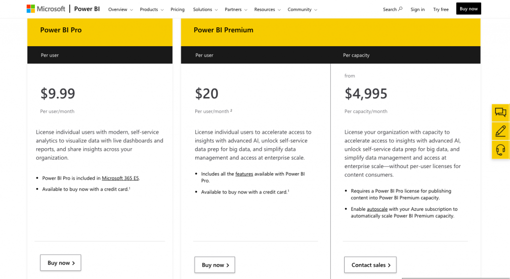
Pricing
Power BI offers two different price plans: Power BI Pro and Power BI Premium, in which Premium divides into two categories “per user” and “per capacity.” The pricing is dependent on the number of users, and each plan provides all the basic features of Power BI. Premium plan is more comprehensive than the Pro plan and can autoscale with your Azure subscription.
Google Data Studio
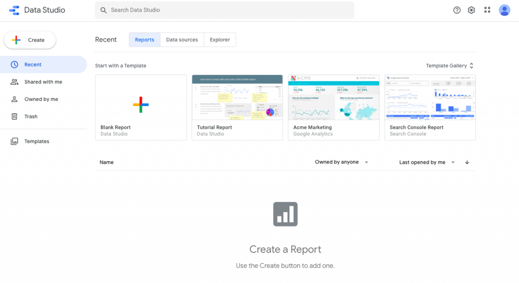
Google Data Studio is an online data visualization and reporting tool part of Google Analytics 360. It helps you turn your raw data into action by generating configurable charts and tables.
Share and Collaborate
Google Data Studio is a highly accessible and shareable tool that helps to enhance communication within the business. Different teams and departments can easily view and edit reports while also accessing various visuals. You can also collaborate on the same project simultaneously, speeding up the process of data visualization and display.
Connecting Data
Google Data Studio is a highly accessible and shareable tool that helps to enhance communication within the business. Different teams and departments can easily view and edit reports while also accessing various visuals. You can also collaborate on the same project simultaneously, speeding up the process of data visualization and display.
For example, you can collect data from:
- Google Marketing Platform products, including Google Ads, Analytics, Display & Video 360, Search Ads 360
- Google consumer products, such as Sheets, YouTube, and Search Console
- Databases, including BigQuery, MySQL, and PostgreSQL
- Flat files via CSV file upload and Google Cloud Storage
- Social media platforms such as Facebook, Reddit, and Twitter
User-Friendly Dashboard
UI of Google Data Studio resembles Google Drive. Therefore, it is pretty easy to adapt to and activate the product. This gives an advantage of quickly starting to collect and visualize data. Similarly, its simple and clean design helps you navigate through the different features of Google Data Studio without having to worry about which feature is where. Also, the interactive tools on the dashboard are designed to help you get the most out of Google Data Studio.
Reviews
Google Data Studio got 4.4/5 on Capterra out of 131 reviews and 4.3/5 on G2 out of 309 reviews.
Here are some positive reviews:
“I love how easy it is to put the data points into different graphs and visualizations. The UI is typical of Google. Super intuitive and user-friendly and most aspects of the product behave exactly as a user would expect. Ease of use is by far what makes Google Data Studio stand out among the crowd.”
“It seems that every third party SaaS that collects data online has native synchronization support for Google sheets. And this is how Google Data Studio makes itself the best option for non profits and small businesses in need of automated business intelligence. On top of the plug’n’play integration experience, data studio has a unique approach to interactive chart and dashboard design that lets you position elements as if you were working in Adobe Photoshop.”
“To have a tool that give to you the opportunity to develop a complete dashboard is amazing, and the fact that that tool is free, is awesome.”
And negative comments are:
“There will be instances when the software has lag when the data tends to be that of a 12 month period. There will be a time when you will have to archive old information.”
“ If you are trying to pull in data from multiple sources that is not well organized or similarly setup, it will be next to impossible to use this software. You will have to spend a lot of time re-adjusting your data to work with Data Studio.”
“Despite Google Data Studio’s prowess, unfortunately it can easily become overwhelming and unwieldy to manage. The learning curve for the program can be quite extreme; especially when you start to dive into custom formulas for data. While custom formulas seem to line up with formulas you might be familiar with in Excel, they don’t – some formulas match, while others don’t exist, and yet others do different things than their name-sake in excel.”
Pricing
Google Data Studio is a completely free tool offered as part of the Google Cloud Platform. Just like any other free platform of Google, such as Google Sheets, you can create, edit, collaborate, and share without expensing your budget.
Tableau
Tableau is another BI tool that offers interactive data visualization. With Tableau, you can easily turn data into actionable insights. It uses relational databases, online analytical processing cubes, cloud databases, and spreadsheets to create graph-type visuals.
Data Visualization
Data visualization is a powerful component of Tableau because rather than generating elementary graphs, Tableau creates elegant and hyper-realistic visuals that enhance your understanding of your data. Its sophistication makes your data expressible and accessible, which is are essential components to make data visualization effective.
Tableau also offers different types of visuals for different purposes. Therefore, you don’t need t think about how to “fit” your data into a specific type of graph. Here is some visualization Tableau provides:
- Motion Chart
- Histogram
- Hropoleth Maps
- Stacked Column
- Heat Map
- Highlights Table
- Bullet Chart
Dashboard
Tableau has one of the most user-friendly but complex UI among the BI tools. This makes it an easy tool to learn and adapt, but its simplicity doesn’t diminish its power. It can easily handle big sets of data and run a comprehensive analysis of them.
Its dashboard is why Tableau is both a simple and in-depth BI tool. The multipurpose dashboard can do all the basic features any dashboard can do: making quick changes, developing presets, customizing visuals, etc. However, with Tableau’s dashboard, you can go beyond. With Tableau, you can create interactive models, use various visuals/formats, collaborate seamlessly, etc. This allows you to manage your data and display it effectively.
Predictive Analysis
Usually, predictions take time since you need to consider different variables and combine data from different sources. However, with Tableau, analyzing historical data to make a prediction is both easy and time-saving.
Tableau has reliable front-end and back-end servers, which is why it can quickly format rend lines and forecast your data. This ensures that the predictions are accurate and precise. Also, the drag-and-drop interface helps you to select relevant parts on your dashboard easily.
Reviews
Looker got 4.5/5 on Capterra out of 1561 reviews and 4.4/5 on G2 out of 1,058 reviews.
The positive comments were:
“The tool is an all-you-need data visualization solution. It allows presenting data both in graphic and tabular form. Filtering and ad-hoc queries on existing dashboard are relatively easy to use for everyone.”
“The ease of use and availability of learning resources. Tableau is intuitive and you are able to understand how it works very early in your learning. When you do get stuck, Tableau has an amazing forum where other Tableau users are willing to help you learn.”
“It is a very interactive tool which can represent data in the form of graphs, charts, and makes the decision capacity very easy. It can handle the statistical analysis with ease and gives excellent results. This is very useful for business data analytics.”
There are also some reviews that didn’t agree with the positive ones:
“I would like to see a more complete set of manuals. Statistical knowledge is not necessary, but some of the expressions on the screen are difficult to interpret, and it takes time to get used to them. The visualization is not intuitive, and when you try to do something a little more elaborate, it has its own quirks, and I think it requires training to make the visualization look the way you want.”
“The three biggest drawbacks to our organization continuing with Tableau were ease of use, cost scalability and functional scalability. Tableau is not the tool for organizations that lack technical resources. It’s not as “plug and play” as other options on the market and requires significant training of architects to fully take advantage of all its capabilities.”
“Tableau is great but it really was confusing at first, especially without any help or tutorial, the software had too many functions that it can take time to be able to learn a single task in it.”
Pricing
Looker doesn’t disclose its price plans on its website. To create Tableau offers price plans in three categories: Teams & Organizations, Individual, and Embedded Analytics. For Teams & Organizations, you can choose from Creator, Explorer, and Viewer plans and decide whether you will deploy with Tableau Online or Tableau Server. Creator, Explorer, and Viewer cost $70, $40, and $15 user/month (billed annually) consecutively for deploying with Tableau Online. If you choose Tableau Server, the price plans are slightly cheaper.
According to third parties, even though there is no information about price plans, a default ten users plan starts from $3,000 – $5,000 per month.
Conclusion
Business Intelligence software are helpful tools that can enhance your data collection, preparation, and visualization. Domo, mainly, is a good choice if you are looking for a mobile solution that you can access anywhere and anytime. However, according to your needs and preferences, you may need to look for other alternatives that best suits you.
The alternatives we have looked at are all great tools to help you step up your data visualization. However, each offers unique features that might be beneficial for some businesses and detrimental for others. Therefore, to choose the best tool for you, you need to compare different tools and consider your needs.
FAQ
Unfortunately, Domo does not disclose its price plans to the public. However, there is a free demo in which you can try the essential features and see on-live what Domo can do for you.
No, it is not. It doesn’t have a steep learning curve, meaning you can easily adapt to the tool. Domo also provides a “university” where you can learn how to use the specific features and enhance your understanding of Domo.
Since Domo is cloud-based software, it is hosted in true cloud infrastructure and delivered as a SaaS naturally.