Why You Should Use a Sales Dashboard + Template to Steal
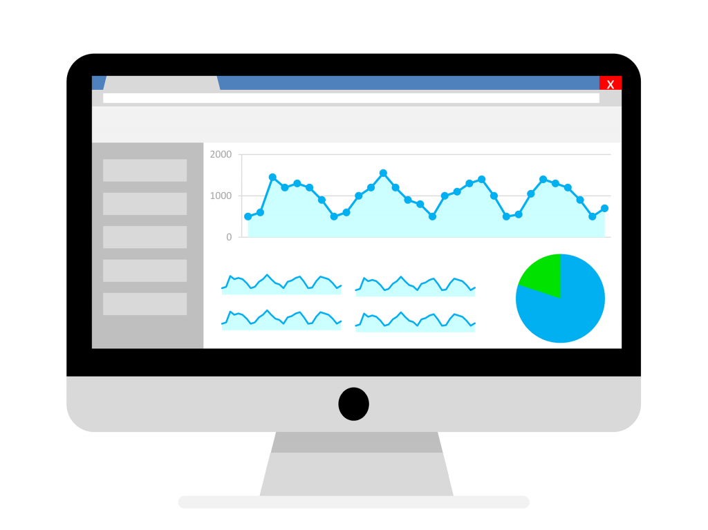
A sales dashboard is a visual display of your data for monitoring the health of your business or sales department by displaying all the necessary management KPIs (key performance indicators) and vital data points in one place.
A dashboard utilizes data visualization to simplify complicated data sets, allowing users to receive an overview of current performance at a glance. All data can be visualized by software using charts, graphs, or maps.
The more data you have on your sales pipeline, the better decisions your sales team can make, and the more leads through the different stages of the buyer’s journey.
In this article, I’ll explain the benefits of a sales metrics dashboard, what it should include, and best practices while creating one.
If you want to learn more, keep reading.
Why should you use a sales dashboard?

Now, you’re probably already aware that a sales dashboard can help you keep track of and analyze your sales data with the help of visualizations.
But that’s not all there is to it.
Here, I’ve listed several other reasons why you should use a sales dashboard:
1. Enables you to identify sales growth opportunities
A sales dashboard helps you identify cross-selling and up-selling opportunities for expansions and, therefore, increases your revenue. It allows you to identify who your best customers are, where your challenges lie, and what changes might be needed to increase revenue.
2. Offers real-time data analysis
Sales dashboards, such as the ones you can create with HockeyStack, constitute real-time data. This means that your sales team no longer has to wait for data readied for them by professionals or data analysts. Instead, they can access the data they need immediately and get to work on improving your sales.
3. Improves collaboration between departments
A sales dashboard can also help improve the collaboration between your departments. For example, as I mentioned above, it enables you to identify sales growth opportunities by providing heaps of data on the dashboard.
This information can be easily shared with the entire team to make sure that everyone is on the same page and working to achieve common goals.
What makes a good sales dashboard great?
I talked about why you should have a sales dashboard above. And having any kind of sales dashboard in place is great! But there are some factors that will definitely improve efficiency for you and your team.
Here is a list:
1. Ease of use
No one likes using an application that is confusing or has a steep learning curve.
The same rule applies here. In order to use your sales dashboards effectively, they should be easy to use and understand. If you feel it is clunky or hard to use somehow, It will definitely limit your ability to interpret and utilize your sales data.
2. Good design
Swimming in data, trying to make sense of it, and making important decisions while trying not to get lost in many menus and settings is obviously a challenge.
And a good UI design is not there to only be aesthetically pleasing, it can actually boost your effectiveness and accuracy through visualization and ease of navigation.
Visualized data is easier to focus and work on through extended periods of time. With an uncluttered design that focuses on the data and metrics that really matter, you won’t get tired as quickly.
3. Everything in one place
I talked about working on data through extended time periods above. Now imagine doing that across different platforms or tabs trying to make sense of all your data while noting down different variants that you need.
That’s why having everything in one place is critical.
Although having all your sales data in one easily accessible place will help you out a lot, you should be careful not to cramp everything into a little box that overloads the viewer with a lot of data and becomes confusing and hard to use instead.
4. Constantly updated data
This one is pretty much self-explanatory. If your dashboards are updated in real-time, it saves your time by allowing you to get right on analyzing your data without any delay that may cause setbacks caused by not resolving an urgent issue with your business in time. And you can check what’s happening with your business whenever you want.
What should a sales reporting dashboard include?
Although it varies from company to company, there are a few metrics you should consider having in your sales dashboard.
Here, I listed some.
1. Lead-to-customer conversion rate
The lead-to-customer conversion rate, also known as lead conversion rate, is the proportion of leads of a company that result in actual sales. This metric is critical to evaluating the performance of a company’s sales funnel.
If you know your lead-to-customer conversion rate, you can compare the effectiveness of your company’s various marketing channels, seeing how effectively your business converts its qualified leads into actual customers.
2. Customer churn rate
The Customer Churn Rate is defined as the number of customers who stopped using your company’s products/services in a given time period. Therefore, it provides you with insights into the success of your retention strategies.
It is calculated by dividing the total number of customers at the beginning of the month by the number of customers you ended up losing.
3. Sales target
Sales target is a metric that allows you to understand if you are on track with your goals. This metric helps you see if your team functions as they should and if they need help or a change in the strategy.
4. Sales growth
Sales growth is a metric that is an indicator of how your sales figures have changed over time, which makes it nearly essential while creating a sales dashboard.
A positive change in sales figures over time is an indication that you are on the right track.
Best practices for creating a sales dashboard
As I mentioned, great dashboards are clear and user-friendly. And when it comes to being user-friendly, it comes down to the design most of the time.

But that’s not all there is to it.
I listed below, 5 other best practices for creating a sales dashboard.
1. Consider the audience
You need to know who’s going to use the dashboard and for what purpose in order to create the best experience for them. The context varies greatly on how it is intended to be used. Will it be checked regularly on the go from phones? Will it be used often in presentations? Or do you want your dashboards always on display in your office?
Additionally, try not to make your dashboards too complex as it could lead to a need for people to re-analyze all the data, wasting precious time. For example, a dashboard shouldn’t require you to make calculations on your own to get the information you need.
2. Determine your goals
Setting the right goals will highly affect the way your sales dashboard should be designed and used. Whether you are creating a dashboard for your clients or for an internal presentation, they have to serve a purpose and answer key questions through the data.
In this step, it is important to understand that not all pieces of data will be relevant to your goals and that your goals should be determined beforehand to get the most out of your dashboards.
3. Choose relevant metrics
For a truly effective sales dashboard, selecting the right metrics is a must. Once you determine your goals, you will select the metrics best suited to your needs.
Your metrics will help to shape the direction of your dashboards as they will comprise visual representations of relevant insights based on specific areas of your business.
4. Tell a story with data
Data storytelling is the process of presenting data in a way that will give you the entire context in an easy to understand way. In other words, efficient data storytelling will help you convey your message in the clearest way possible in order to see possible strategies you can implement.
A good practice for efficient data storytelling is to design your dashboard beforehand. Checking out a sales dashboard template and planning what data and charts you will include based on your goals will help you be more focused when you start building your dashboard.
5. Provide context
How do you know if a number is good or bad? Or how do you know is it better than before?
Providing context is essential when building a sales dashboard. Without comparison values, some numbers on your dashboard can be meaningless for the user.
Always try to provide maximum information even if some of that information is obvious to you.
HockeyStack’s sales dashboard template is up for grabs!
You can find the sales dashboard template best suited for you with HockeyStack. As an example, let’s have a look at the sales dashboard in the HockeyStack live demo:
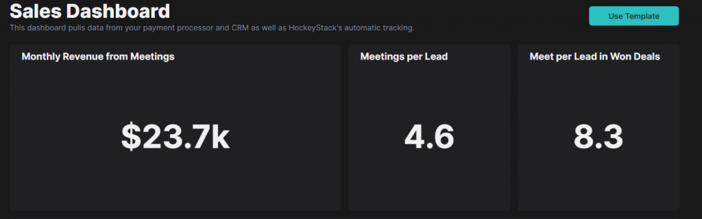
As it explains there, HockeyStack pulls data from your payment processor and CRM and it has an automatic tracking feature that extracts real-time data. This means that you can access all of your data in one place.
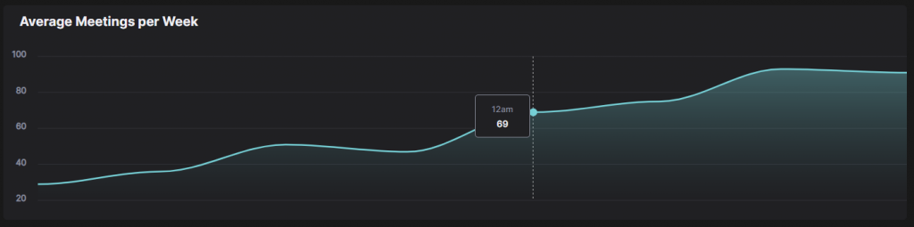
You can keep track of sales and other kinds of data with several templates by creating all sorts of dashboards in seconds. You also can create your own dashboards from scratch if you prefer.
You can have more detailed information easily with its interactive charts. Just hover your mouse over a funnel or chart, and it will show you more detailed data that you need with its intuitive design while looking good at the same time.
With HockeyStack, you can keep track of your sales and many sorts of data. Staying informed in a situation where you might need to make an important decision regarding your sales team, certainly will be valuable.
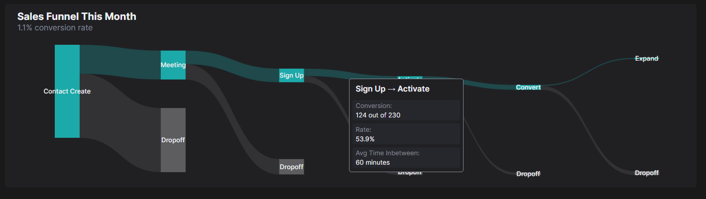
With these dashboards, you can extract key insights including the revenue you generate through each marketing channel. This will help you plan your marketing budget better and invest in more lucrative channels.
Key takeaways
Keeping track of your data is imperative. Your sales data is no different. Having a sales dashboard that tracks your data in real-time and helps you keep up with your goals will definitely save you time and help you gain insights from your data.
Ensure that your sales dashboard is easy to use, well designed, and keeps all your data in one place for you to overview.
Also, don’t forget to keep in mind the best practices I listed above to help you through your journey. Like considering the target audience for it or using only the necessary metrics or KPIs on it.
Start leveraging a sales dashboard today to start seeing opportunities for improvement, track leads, and make sure you are on the right track to your goals.
FAQs:
How do you create a sales dashboard?
- Determine which sales metrics you’ll track.
- Identify how the dashboard will be used.
- Pick a sales dashboard provider.
- Pull data into the dashboard.
- Build reports for the sales dashboard.
What are sales KPIs?
A sales KPI or metric is a performance measurement that is used by sales teams and by the top management to track the effectiveness of relevant sales activities within a company.